"Does It Look Like Me?"
One of the artists that attend my Wednesday Studio has
completed a portrait as a gift for her grand son.
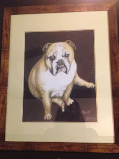 |
| Portrait of Tank, Framed |
Colored Pencil portrait of “Tank”, her grand-puppy.
When she came in she was overall pleased with the likeness.
This is definitely Tank, not a generic bull dog. But there were still some
problems. Overall there was more of the texture of the heavy paper showing than
she would have liked.
“When I bought the pad, (it is #140 lb paper) it said ‘Gray
Scale’ on it. I thought they were talking about the color, now I think it is
the texture of the paper, scaly!” was Mary Anne’s take on it.
The pad does scale through all the shades of gray. And I am sure this is what they meant by gray scale pad, but the
texture of the paper is very definite and it can overpower the art done on it.
And it looks like scales. With colored pencil this can be a problem. Finding a support that has enough
tooth to hold the colored pencil but does not have an overwhelming texture.
Also, she was not at all happy with the forepaw. It looked
like a blob, she said. The fine details were giving her trouble. There were also details
in the face that needed attention.
It took some time to stop
and think.
When you run into problems in art, the instinct is to push
ahead. Drowned it in details, in fancy brush work, lines or gobs of color. Wrong
approach.
Stop
and
Think.
Art happens in the head first, and here is where the
solution will reside.
With Tanks paw, we had to come back and think of just what
we were drawing. The leg is a column, the foot (paw) is basically a rectangle
attached to the column (leg) by a fat little ankle. So these shapes must be accurate
first, then shaded to give shape to the volume. The shapes of the
shading is important too. It needs to make sense with the light source, and
there is always a light source, or how could we see it!
Once these issues were address, Tanks leg and paw emerged
from the page.
Background is still there.
Mary Anne elected to have a simple, color block background.
Fine, it suits the portrait well, but it still needed to be addressed with the
same care as the rest of the portrait. Background is not an afterthought, but an important part of the composition.
Sometimes we as artists can be a bit lazy about this, or
even cheap. We don’t want to spend our time and effort on what may seem an
unimportant part of the art. But a good background is what makes the subject
pop.
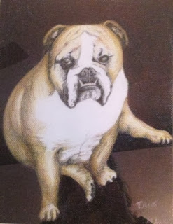 |
This is Tank,
And he is looking fine! |
So time was spend to develop this background, first layers
of crimson lake then blue indigo. Not just one layer each but multiple layers
red/blue then red/blue. There is even a layer of black in there.
The result? A strong background that makes tank jump out and
give the appearance of an oil portrait.
Other than the canines, bull dogs have rather small,
delicate teeth. These where hard to get with regular pencils. Here is where
Very Thins, by Prisma color came in. These harder pencils are not something you
would want to use every day, but are just the thing for fine detail. Which is
what they are designed for.
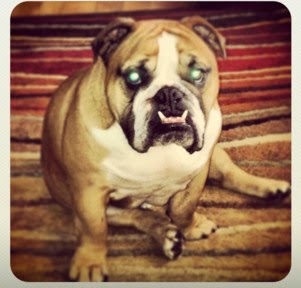 |
| Tank- reference photo |
Addressing the eyes, Mary Ann’s reference photo did not give
the eyes a good go. Dog pictures seldom do, but this is a dog she knows and
loves, and here memory came to her rescue. Instead of solid black, which in a
photo a dog’s eyes can appear, she worked layers of black/brown and white to
give his eyes life.
All in all this is a drawing of Tank, not just any bull dog.


 I did not have as much time as usual to work on Wednesday. Although I came into the gallery early, there were visitors and business to take care of.