Monday, May 9, 2016

For the Birds


Here it is so far. My Heron.
 
So far I am simply trying to keep the shape of the bird, the location of the major feathers and keep from destroying the drawing. At this point, I am thinking, "why did I start this?"
 
I do this all the time.
 
Once I get into a project, I am sure it is beyond me and feel like a total failure.
 
I can't do this.
 
I am no good, I will never get these detail right, who wants to draw all these features any ways, and why, if I have to do it, I did not simply paint it, It would be easier!
 
Leave this to real artists.
 
I always feel this way,
 
Sometimes it works, sometimes it doesn't.


Monday, May 2, 2016

Editing the Landscape

I think I might have bitten off more than I can chew!


This is a totally dense picture, and it will take a lot of patience to develop all the layers needed. Not just layers of colored pencil, but layers and layers of details.

I was working on it more or less as a drawing. Flat, laid out on a table, but that just is not working for me.

This drawing will have to be approached more like a painting, upright and looking to develop depth.

So it is back to the easel, upright and with my pencils held more like a brush. I need to see the entire drawing as it develops. I need to step away and view how each grouping relates to all the other areas of the work. With an oil painting, I would work dark to light, but with colored pencil I will need to work more like a watercolor, light to dark. I am working to locate the major shapes, the large blocks of value, and leaving my areas of light coming through the trees. How to select what to put, what to leave out.

The trees themselves are presenting more of a challenge. Both the rough texture of the bark along with the mosses and leaves covering all surfaces. These trees are a wealth of color and texture. Not just the bark, although that is challenge enough. These are old trees. They have lived and endured and they show it. Every time I look at them I see what a wide range of colors! From the darkest browns, up through actual white. Highlights and scaring. Mosses and lichens. Texture. What I do not see is actual black, except for the boles.

Green. Not a simple color under any circumstances, simply explodes here. The Spanish moss ranges from light almost white green down through gray-dark.

This is going to be a matter of editing. It does not work to simply try to draw each leaf and blade of grass. There are strong shapes here, but also highlights and texture. How do I convey the idea of the dense landscape without making a jumbled mess of it.  

Monday, April 25, 2016

Using Wax Blender Pencil

Working on a dark background can present real challenges for colored pencil. Unlike oil paints, you cannot count on pigments to overshadow the dark underlayment. Also, you do not get the reflective qualities of Titanium white, which is why canvases are usually coated in white paint before you start painting.

Titanium white is highly reflective. That is why it is chosen for this under layer. As the light passes through the layers of oil paint, it is reflected back and brighten by Titanium white.

White and super white papers perform the same function for colored pencils. Many do not realized just how transparent colored pencils are. But they are. Not as transparent as watercolors, but someplace more transparent than Quash. Now, you can get very good, very dramatic results using colored or toned papers and backgrounds, but you do have to know how to work with it.

For the small Heron drawing, on a dark toned paper from Colourfix, I am using a combination of studio white pencils, and a clear wax blender pencil from Prisma color. Putting down a layer of pure binder wax, which is what a blender pencil is, will give me a good base to blend in the many, many shades of white/blue and gray that make up this bird.

On this blue/gray background the pure wax is leaving a coating of white wax that will allow great blending. It will also add to the drama of the finished piece, acting as a reflecting layer underneath the pigmented layers.

Monday, April 18, 2016

Starting New Colored Pencil Pieces Part 2


Part 2


 Supporting the Art.


There are many, many surfaces you can use for colored pencil.


Anything you can drawing is valid. 

You can draw on paper, wood, copper, velum, tiles. There are few surfaces, however design with colored pencil in mind. Many multi-media papers list colored paper among the media acceptable, but many are actually difficult to use. 

What you choose depends totally on the end results you wish.  

Just about any surface that will accept charcoal or pastels has enough tooth to use. One consideration is just how much it can take. 
 

Charcoal papers tend to be thinner, lighter than pastel. With all the layering most Colored pencil artist do, most charcoal and even standard drawing papers tend to be too light and thin to take it.
 

Heavier pastel papers work well, and toned papers lend themselves to dramatic results.

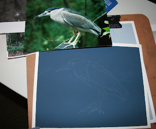
I have been using Colourfix toned pastel papers for my more recent colored pencil pieces. They help to set the tone of the pieces, as well as providing excellent tooth and support for colored pencil. The rough, sandpaper finish provided more than enough tooth to hold multiple layers of colored pencil, and allowing the work and rework of the medium. It is also thick enough to allow the use of watercolor pencils, water, and solvent washes. All in all. a good choice.

For the Heron, I want the bird to stand out against the dim background, very similar to the mood of the location when I photographed the bird. It was in a dense forest setting, rather dim. And I want this feeling to come through the drawing.

 
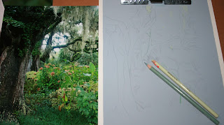
For the landscape, I really want the humid, overgrown nature of the landscape to be highlighted. The medium toned paper will set the tone of the light, allowing me to go both darker and lighter. The photo was taken at the Brookgreen Gardens in North Carolina. Here, Many of the iconic plants of the south are on display.


Monday, April 11, 2016

Starting New Colored Pencil Pieces Part 1


Sometimes simply finding something you are sufficiently interested in to carry to completion is the actual artistic challenge.


While many scenes might catch your interest, is there enough there for carry though? What might keep your interest for  a quick sketch, a 20 minute drawing or afternoon painting will not hold enough interest for what can be days or even weeks in colored pencil.


Like a fine oil painting, working in colored pencil can take time. For a large piece this can be a major investment in time and effort.


Creating a work of art is more than simply copying a photograph. While a good photograph can be a good beginning, each artist adds/subtract, enhances, edits and refines whatever reference material she/he has.


Any work of art starts with an idea.


Monday, February 1, 2016

Mallard Duck: Female

Continuing work on the female mallard.

Building the second layer of color. This surface will take even the cheaper pencils, the studio level and throw-away pencils, so I am using them on the bottom layers.

I did do a wash of solvent, especially on the water to mimic watercolor and the fluidness of water.


Although the complimentary colors are beginning to be covered, their inclusion is adding to the richness of the final colors. This will give much more dimension to the duck than the photograph.

Tuesday, January 26, 2016

Beginning a new Duck Drawing

New Drawing: Female Mallard


Working on Colourfix paper.

Sketch on colourfix paper

Working dark to light.


Starting with sage green colourfix paper, I used white to get the sketch onto the very dark surface. When working on a dark background I do find using vivid and light complementary colors helps to give the focal image more impact.


Note: Colourfix is a fine tooth Pastel and multi-media paper by Art Spectrum. This is an Australian company, but most on-line fine art retailers will carry it. I got mine from Cheap Joe's in North Carolina.

 It comes in a wide range of colors, formats and you can now buy the surface in jars to make your own papers. Worth trying for colored pencil.


http://www.cheapjoes.com/catalogsearch/result/?q=colourfix

Starting with the dark, I spent time studying the colors of the bird. I used shades of purple for the underpainting, purple, lilac and lavender Primsacolor pencils along with some of my studio whites.

Colourfix has such texture that you can use the cheaper, less satisfactory pencils in your stash in your underpainting. You can even use Crayola pencils.

I choose the colourfix sage green to enhance the feeling of dark undergrowth. These ducks were in shallow water in a very weedy stream.


This should give the feeling of deep, dark woods.


Already I can see way the duck will stand out in this image, even after I add the yellows and browns to the background vegetation. The duck will be the focal point. Yes I will have to add the details missing from the reference photo. That is ok. I am the artist and I can do this.


Underpainting and Reference photo
     With the purple underpainting, even when I add the browns for the feather colors, it will not be lost in the dark background color. With a good underpainting the colors will be richer and more saturated.


   I think this will be a good drawing.