Monday, April 22, 2013

Final Steps Blending, Highlights And Burnishing


These flowers are more than purple. Like all colors in nature, they are more a blend of color than a pure pigment.


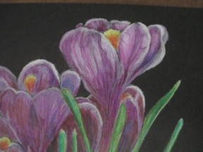
Layers of purples are between layers of white and a touch of red. The stamens are shades of orange-red to light yellow.


Between each layer, I stop and using a stump, blend each layer to the previous layers. I also want to blend the stem of the flowers (purple) to the green stem, shading through white. This is how the flowers grow, and I want to continue this.


I also want to bring back the white highlights on the crocus itself and its leaves.


I do use a blending stick for some of this. This is a pencil that is pure wax. Using it helps two colors of colored pencil blend into each other.


Then I do burnish the entire picture, using the burnishing tool, rather than the paper stump. This brings a nice polish and shine to the drawing. It helps it jump away from the paper.


I really like the contract between the dark paper and the vivid flowers.

Monday, April 15, 2013

A Little Color


Having done the white underdrawing, it is now time to take the plunge and start adding color.


Scary
adding first color


I am fairly happy with the black and white version, so picking up the next pencil can be scary. Starting with my lightest violet, and a very sharp point, the color is slowly being built up. The same for the green leaves. The palest green is added first.


After a single layer of color is put on, the drawing gets a gentle burnish. I use a stump for this, rather than a burnishing tool. The point isn’t so much to blend but to even out the layer of color and make sure that it adheres evenly and thoroughly.


Again, step back from the drawing to judge its development. I don’t want to completely cover the black, The darks are needed.


first layer before burnishing
Each layer is put on with successively darker violets and purples. Not all the previous layer is covered. Attention is taken to just where the light is coming from and making sure that the darks balance out with light and mid-tones.


Remembering that I am drawing on flat paper, but the crocus is 3-dimentional, the goal is to make them look as if they are coming off the paper.


After the second layer of purples, another layer of white is added to the entire picture. This brings harmony to it.


But the drawing is not done yet.

Monday, April 8, 2013

White Lines On Black Paper

faint white lines on black paper
I have the outlines of the drawing I want to do. The white lines are thin and faint. They will be only guidelines, so this is perfect. The actual drawing will follow.


When working with toned or colored paper I take an approach just as I would for on oil painting. I do an underdrawing.


Because I am working on black, I am doing it in white first. This does two things, it establishes a light, bright base for the following layer of colors, and helps me fine tune the actual drawing. The white base allows for the subsequent colors to be clear, bright and true. 


White value drawing
First I use a rather blunted white pencil, simply to establish this base of white, then I will follow it up with a sharp white pencil to emphasis and correct the drawing. At this point I need to correct any flaws in the basic drawing, make sure I have a full range of values and that the drawing itself hold together.
 
This is a good time to walk away.
 
Make sure the drawing works, both technically and as a work of art.
 
 
Now, we are ready for a little color.


Thursday, April 4, 2013

Crocus Drawing in Colored Pencil - Start

drawing on tracing paper


Started a new drawing.


It is part of the colored pencil magazine on-line drawing challenge.


I started by sketching the layout on tracing paper.


1. because I like drawing on tracing paper. It is easy to draw on and easy to make corrections to, so for me the ideal medium for layout


2. I am going to do this on black paper and drawing on the semi-transparent tracing paper makes it easy to transfer the design to the rather fragile black pastel paper.


Pastel paper has a better tooth than watercolor paper, at least for me with colored paper. But it is more delicate.  It is easily scratched and dented. Once you get scratches or dents in the paper, you can’t get them out.

 
back of tracing paper with colored pencil

With the tracing paper I can make my own transfer paper. I don’t have to use graphite at all.


Turning the paper over, I simply take a soft white or light pencil and softly transfer some pigment to the back of the tracing paper. Then using drafting dots place the tracing paper over the paper I am going to use. Then using a blunted pencil, I transfer some light lines to the black paper. Because I am using the clip board drawing board I can check to make sure the lines are transferring, and that I am not getting indented marks.


White lines transfered to drawing paper