Monday, August 25, 2014

Flesh Tone Mixing Basics


You can buy a tube of flesh, but it will never, ever match anyone. You can use it as a basic pigment, and then modify it. Or you can make your own basic mix.


Your Pallet.


White. Always start with white, even for black skin. Titanium is a highly reflective paint. Most artist have this already on hand. Portrait artists have traditional used flake white, which is a bit warmer, more yellow white. Zinc white is more transparent and mixes well. This can be a plus when mixing with other pigments. Any white you are familiar and comfortable with can be used. You might want to try some new white.


Red. Any red will do. Red, although considered a warm color comes in many hues, some warmer than others. While the cadmium reds are quite warm, alizarin crimson is regarded as a rather cool red. If you choose alizarin crimson make sure you get a permanent hue. Alizarin crimson has had some permanency issues. Most modern, quality paints has solved this, but look at the light fastness rating on anything you buy.


Yellow. Again, yellows do come in warm/cool version, like lemon yellow and yellow ochre. You can use either, but it will effect the final mix. Experiment and become familiar with each of your yellows. I personally feel yellow ochre can ad a richness to several skin types that make it worth having in your pallet box.


Green. Yes green. All skin types, colors, shades have a touch of green in them. All, no exceptions. I learned this right out of high school when I worked for a photo finisher. Their expert retoucher taught me how to work on portraits. In those days (back at the end of the last ice age) when we retouched a photograph, we literally did it, with pigmented inks. She always “closed” an area she had retouched with green. She was both a skilled craftsman and an artist. Without the green the tone is never right. Years later this was confirmed by a very skilled and gifted portrait artist who only works in watercolor and always lays down a layer of green before any other pigment for faces.


On Your Pallet.


Always arrange your pallet the same way. I start left to right with my warm colors then cooler.


White is in the upper left, below will be yellow, red next to the white, then in this case orange, lastly  green and blue.


Take a medium amount of white, about 2 nerdles ( a nerdle is the amount you would put on your toothbrush)


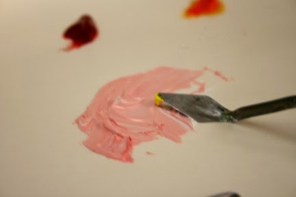
Always mix color into white, not white into the other colors. Taking the tip of your pallet knife move a small amount of white to an area to be mixed. With the tip of your pallet knife mix a med to light pink, this will depend on who you are painting, but start light! It is very easy to go dark, not so easy to go light. Mix with the back of the knife until well blended. Use another knife to scrap off the back of the first knife. This is your starting point.


When you have this mixed, blend in a small amount of yellow. You will begin to see a light peach beginning to develop. If you need to go darker add just a tip of red, then yellow to blend out a darker peach.


To tone this down. Dip just the tip of your pallet knife in the green and blend, blend, blend.


This should be your basic skin tone.


This is even true for black skin.


You want the basic tone to be a mid tone of your subject.


Tuesday, August 19, 2014

First Portrait


Wednesday Drawing Classes are starting oil painting portraits. Yes, painting in oils. First up is to select a large, 8x10 photo to use as a reference. Then make several black & White copies. Cheap, copier copies that can be drawn on.


So, how do you go about this? There are about as many different approaches to portraiture as there are artists. No one is “correct”. The right approach is the one that gives you the results you want. Since these portraits are for my drawing class, a beginner class with the emphasis on realism, we are taking a classic, academic approach and will use the skills learned already in drawing realistically. 


Having gone over the basic materials needed, we will beginning by blocking in the basic shapes. There are a lot of ways to transfer the image to the canvas, but for this we are going to do a rough block in with oil paints thinned to ink like consistency and doing a basic block in.


Using the black & white copy, we will use straight lines to define the general, gross shape of the image. Also, we will play around with placement. This can be done with simple cut outs. Once we know where we want the image, we can start by fining a starting point on the reference copy, and a corresponding reference point on the canvas. All other measurements will work from this point.


For this first project, we will attempt to draw/block in the head the same size as the photo reference. This will make later comparisons to the reference easier.


The first block in is a rough block in, for placement and overall size. We will locate the major features, the angle of the head, location and angle of the eyes, nose, mouth, and if visible the ears. 
 
Because of the demands of teaching this class, I will be working on more than one painting at time. Hope I can keep them up!
 

Monday, August 11, 2014

Murals - Point Pleasant Flood Walls


I love public art. I think more funding should be allotted for it. Public art enhances a community is a way that really lifts it up.


Not just that community, but all the communities that surround it. It creates a unifying positive atmosphere so  desperately needed today.


Went with friends to the river front town of Point Pleasant, West Virginia to enjoy the murals now painted on the flood walls built to protect the city in times the Ohio and Kanawha Rivers overflowed their banks. Point Pleasant has embraced its riverfront, making it both a protection and a really pleasant place to enjoy a summer afternoon. The murals are well done. Illustrate the area history, from both the native American perspective and the settler’s points of views, and are just for themselves beautiful works of art.
 
An afternoon enjoying the artwork and the park is time well spent. It is time we can recharge our batteries. Taking time to enjoy these public displays lets us realize just how good our lives really art. How much we have. What a rich heritage everyone has in common.

 
Today reminded me just how important public art can be to an area. Even art that is controversial, is important. I remember when the Chicago Picasso was first installed. What an uproar! but now it is an iconic symbol of that city.


Check the history books, and read the first reactions to the Statue of Liberty. Although many thought it horrible, can you imagine New York without it? Years ago we made a trip to New York and one of the things we had to do is take the ferry out to Liberty Island to see this iconic statue.

I am not discounting the many war memorials and statues. These are our history. Simply knowing why that person or this event was considered important enough to be remembered is important. But don't forget the items of pure art. The installations of fabric or large metal flowers. The statues that people look at and scratch their heads. These also are part of our heritage.

What piece of public art do you remember and think is important?
 

Monday, August 4, 2014

Painting and Power Tools


This year, for our 44th anniversary,  Hubby gave me a cordless screw driver. How romantic! Yes, for me it was a very exciting tool and addition to my tool box. You see, I am an artist. Artists use tools. Every medium has its own special tools. Brushes, rags, pallet knives, sculpting awls.


This is not the first power tool he has lovingly given me, but it is one that has me very excited. 


Drawing and painting requires framing. This can be very expensive. So like most artists I endeavor to do a lot of my own matting, framing and mounting of my works of art.


I am not handy. I have trouble holding a screw and a screw driving and co-coordinating putting the screw into the frame.


So Hubby bought me a screw driver, He also got me a set of small bits to drill a staring hole. Hurray! Now I can not only put eye bolts in canvases but I can put on offset clips, and other hangers easily.


Taking the whole kit to class, I was able to demonstrate how to use offset clips to frame a canvas and attach hanging hardware. It was a good demonstration. Class learned a lot. Then we went back to creating art. Drawing. Using pencils, ink, erasers. …..Colored pencils. Mineral spirits, brushes, blending….stumps, hummmmm the screw driver is just sitting there. Tortillions. I wonder……..


It works.