Friday, December 26, 2014

Freezer, Pallets And Other Odd Things Around The Studio


We got a new small freezer for the basement. I love it! Compact and just enough room for two older people. Our large upright gave up the ghost years ago, and being empty nesters, we really no longer needed the big freezer anyway. Funny how not having a teenage boy in the house reduces the grocery bills!
 

Now you are wondering what is all this talk about a freezer doing in an art blog? Yes, its nice she has one, but why do I care?
 

One of the things I did miss about loosing the large freezer in the dungeon is the lost of pallet storage. Yes, pallet storage. Not on the top of the freezer but in it.


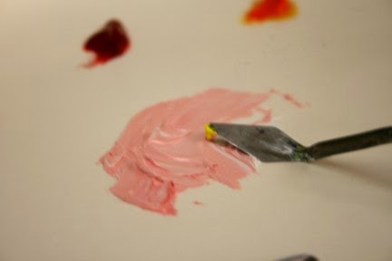
I paint with oils. Often in the past, I had little time to paint. (that full-time job really got in the way of my play time!) One of the best ways to preserve an oil pallet when you know you will be away from it for a while is to freeze it. Freezing does not harm good quality oil paints. This is really helpful if you need to be away from painting for a long period and you want to preserve that special mixed color. Put a sheet of wax paper over the pallet (or another sheet if you use disposable paper pallets) push the excess air out and pop it in the freezer. I used to reserve the top shelf of the large freezer for this.


Now that I am retired from secular work, I usually can get back to a canvas in a reasonable amount of time, and with big projects I have taken to using a pallet box with a sealable lid. I line it with either freezer paper or a disposable pallet sheet. This will keep the paint workable for a couple of days, which is usually all I need. If I paint on Tuesday night, I know I will not be able to get back to it before Friday. I will mound up any paint on the pallet, and seal the lid. (these boxes are also available for acrylics and have a large sheet sponge.)


Often, however, I use a Styrofoam tray for a pallet. The kind that you get from the meat department. When I come home from the store, I always repackage the meat. That plastic they wrap the meat in is not good for it or you. Then if the tray is a good size, I will wash it with soap and water and let it dry. It goes down into the dungeon to be re-used as a pallet. You can clean and re-use it several time. You cannot use it for gesso however. Gesso eats it. I use the Styrofoam trays as a cheap portable pallet. It saves money I can dearly use for other art supplies.


I will go cheap for the furnishing and accessories for the studio. I find garage sales and thrift stores a good source of furnishings. Whenever I buy things, I look at the packaging and think, can I reuse this? Most of my dungeon accoutrements are recycled packaging, garage sale fines or even things I dumpster dived for.  But not for real art supplies.


I don’t go cheap for what I use to create artwork on or with. Experience has taught me that this is false economy. I will not use low-grade paint, pencils or support. I don’t use hardware store mineral spirits. I have culled cheap brushes. Supports must be high quality. But for my pallet? I will recycle. For large paintings I often use a sheet of freezer paper taped to the craft table I got when a local school threw it out in favor of the new plastic tables. It is a heavy Formica covered table that nothing can hurt. I love it. It weights a ton, but I can do just about anything on it. I can tape down the sheet of freezer paper, and when I am done, simply scrub it off. Nothing sticks. Also, nothing hurts it.  I have a lazy-susan on this table that I put my mediums on. I can always find what I need. You know those plastic trays that they sell for holding utensils? They are touted for caring silverware out to picnic tables. I picked up several at garage sales ( I guess they really don’t work well for this, you see them all the time) well, great way to keep brushes sorted.


I used those tin boxes that breath mints come in for kneaded erasers. I am sure you all can think of tons of things to do with those little boxes.


One of the best ways to carry my long brushes is in one of those cardboard wine bottle tubes. they are sold to carry a bottle of wine as a hostess gift.  They are sturdy and have a nice handle. And they will hold your longest brushes.


So I am happy to have a freezer again in the dungeon. Someplace to stash that pallet between painting sessions.

Friday, October 31, 2014

Master Works?


Student Works


I, like many artist take great joy in the artwork I produce. And pride, but mostly joy. However, there is artwork I actually enjoy more than my own, that of my students.

Betty's granddaughter
Artist: Betty taking classes since July
First Painting ever!
 

I am constantly amazed by them. I throw out the challenge, and they constantly exceed my expectations of them.


Sometimes it seems as if my own greatest works are not the ones produced by my hands but the artists I have instructed and inspired to exceed their own expectations.
Sister
artist: Julia
 age 16

Monday, October 13, 2014

Beautiful Places


Beaches and mountains abound in beautiful places. That almost goes without saying. That is why we go there. But even when there are many, many beautiful places some stand out as extraordinary.


We went to Brookgreen Gardens along the coast of South Carolina.  Brookgreen Gardens


There we came to a really special place, their zoo. There Cypress Aviary is such a special place. It is the only known aviary built over an existing cypress swamp. You go in, and watch the birds simply enjoying being a beautiful bird. They nest and hunt in this swamp. And they are used to people. While they are still wild birds, they react slowing to people by simply walking or flying away.
 
If you sit quietly, they ignore you and go about their business. Spectacular shots and observations are possible. You can see them flying or wading, caring for their young and teaching them to fly. Often they will be curious about you, and come in for a rather close-up view of what you are doing.


The entire garden complex is a great place to fine a quite corner and bring out your sketchbook. 

Thursday, September 18, 2014

Working Hard on Portraits

My students at the Renaissance Art Gallery have been working very hard on their portraits and other projects.

All are showing such promise.

This week I was able to draw the correlation between standard anatomy and cartoon characters. For us to relate to these invented people, they have to strike a cord with us, and with thoughtful creation, even a robot can have a more human or humane connection.

Worked also on how we change as we age, not so much inside but outside.

A lot for them to absorb.   I often think when their parents send them to art class they have no idea how much thinking, planning and soul searching is involved in art.

Because it is a visual art, so many simply dismiss it as thoughtless. As we all know, that is simply not true. Which is why students that are exposed to the arts early do better in math and science.

We need more art. We also need more appreciation that art is necessary.

Art happens in the head, only then can it come out the hands.

Monday, September 8, 2014

Portraits: Likeness vs Identity


Working With Faces


Nothing is as scary as trying to paint a likeness of someone you know. Especially if that person will see it!


How do you go about it? How realistic should you be? When it is someone you know well, there are tons of emotions involved. It is really hard to view them dispassionately. When you need to reduce them to basic shapes, it is necessary to mentally stand back from them and try and get down a good likeness.


But that is not all a portrait is. If that is all you needed, take a snapshot.


But portraiture is more than simply conveying a likeness. It is also about identity. Which is not the same as likeness. This is where it gets hard. This is a person you love, but who is that person? What do they mean to you? What do you mean to them?


Painting someone you know and love can be fraught with all kinds of dangers. While as artist, we revel in each line and wrinkle, so we show beloved mother-in-law with all her (perceived) flaws for all the world to see? Or do we flatter, and thus paint a flawed portrait and to us a lie. Or do we paint them as we see them, with love, acceptance and forgiveness?

Tuesday, September 2, 2014

Unhappy Background

really don't like this background.
Working on three different portraits can be very distracting. But I must take time to really look at each one at each stage.

Not at all happy with the background for my son's portrait. Much to busy and distracting. Not at all what I was going for. So I must change it!

I did select a new pallet for this, related but not quite so yellow. Using more subdued yellow, red and green, created a softer green/gray. I refrained from using black or Payne's gray because of the black gesso that started this portrait.

background pallet.

I did add liquin to help the background dry. I also worked a little background into the portrait, so it would be background, not competing foreground. This way he will be in front of it.

After working the new background in and leaving substantially less of the black showing, I am much happier with this present look developing in this painting.

this background works to complement where I am going with the rest of the portrait. Not too garish, not too bland. Just the right amount of color. While it will reflect what is going into the actual portrait, it is softer, more muted.

The portrait of my mother-in-law is giving me more trouble. While there is nothing actually wrong with the background so far, it just does not seem to be as effective as the background I have on my father-law's painting. That one I am quite pleased with. That total package is turning out as the best of the three so far. I think I will need work live with the mother-in-law painting a while before I can diagnose just what is bothering me about it.

It is difficult to work on all three at the same time, but necessary. Each is providing a demo painting for different students at different places in their own work.


Monday, August 25, 2014

Flesh Tone Mixing Basics


You can buy a tube of flesh, but it will never, ever match anyone. You can use it as a basic pigment, and then modify it. Or you can make your own basic mix.


Your Pallet.


White. Always start with white, even for black skin. Titanium is a highly reflective paint. Most artist have this already on hand. Portrait artists have traditional used flake white, which is a bit warmer, more yellow white. Zinc white is more transparent and mixes well. This can be a plus when mixing with other pigments. Any white you are familiar and comfortable with can be used. You might want to try some new white.


Red. Any red will do. Red, although considered a warm color comes in many hues, some warmer than others. While the cadmium reds are quite warm, alizarin crimson is regarded as a rather cool red. If you choose alizarin crimson make sure you get a permanent hue. Alizarin crimson has had some permanency issues. Most modern, quality paints has solved this, but look at the light fastness rating on anything you buy.


Yellow. Again, yellows do come in warm/cool version, like lemon yellow and yellow ochre. You can use either, but it will effect the final mix. Experiment and become familiar with each of your yellows. I personally feel yellow ochre can ad a richness to several skin types that make it worth having in your pallet box.


Green. Yes green. All skin types, colors, shades have a touch of green in them. All, no exceptions. I learned this right out of high school when I worked for a photo finisher. Their expert retoucher taught me how to work on portraits. In those days (back at the end of the last ice age) when we retouched a photograph, we literally did it, with pigmented inks. She always “closed” an area she had retouched with green. She was both a skilled craftsman and an artist. Without the green the tone is never right. Years later this was confirmed by a very skilled and gifted portrait artist who only works in watercolor and always lays down a layer of green before any other pigment for faces.


On Your Pallet.


Always arrange your pallet the same way. I start left to right with my warm colors then cooler.


White is in the upper left, below will be yellow, red next to the white, then in this case orange, lastly  green and blue.


Take a medium amount of white, about 2 nerdles ( a nerdle is the amount you would put on your toothbrush)


Always mix color into white, not white into the other colors. Taking the tip of your pallet knife move a small amount of white to an area to be mixed. With the tip of your pallet knife mix a med to light pink, this will depend on who you are painting, but start light! It is very easy to go dark, not so easy to go light. Mix with the back of the knife until well blended. Use another knife to scrap off the back of the first knife. This is your starting point.


When you have this mixed, blend in a small amount of yellow. You will begin to see a light peach beginning to develop. If you need to go darker add just a tip of red, then yellow to blend out a darker peach.


To tone this down. Dip just the tip of your pallet knife in the green and blend, blend, blend.


This should be your basic skin tone.


This is even true for black skin.


You want the basic tone to be a mid tone of your subject.


Tuesday, August 19, 2014

First Portrait


Wednesday Drawing Classes are starting oil painting portraits. Yes, painting in oils. First up is to select a large, 8x10 photo to use as a reference. Then make several black & White copies. Cheap, copier copies that can be drawn on.


So, how do you go about this? There are about as many different approaches to portraiture as there are artists. No one is “correct”. The right approach is the one that gives you the results you want. Since these portraits are for my drawing class, a beginner class with the emphasis on realism, we are taking a classic, academic approach and will use the skills learned already in drawing realistically. 


Having gone over the basic materials needed, we will beginning by blocking in the basic shapes. There are a lot of ways to transfer the image to the canvas, but for this we are going to do a rough block in with oil paints thinned to ink like consistency and doing a basic block in.


Using the black & white copy, we will use straight lines to define the general, gross shape of the image. Also, we will play around with placement. This can be done with simple cut outs. Once we know where we want the image, we can start by fining a starting point on the reference copy, and a corresponding reference point on the canvas. All other measurements will work from this point.


For this first project, we will attempt to draw/block in the head the same size as the photo reference. This will make later comparisons to the reference easier.


The first block in is a rough block in, for placement and overall size. We will locate the major features, the angle of the head, location and angle of the eyes, nose, mouth, and if visible the ears. 
 
Because of the demands of teaching this class, I will be working on more than one painting at time. Hope I can keep them up!
 

Monday, August 11, 2014

Murals - Point Pleasant Flood Walls


I love public art. I think more funding should be allotted for it. Public art enhances a community is a way that really lifts it up.


Not just that community, but all the communities that surround it. It creates a unifying positive atmosphere so  desperately needed today.


Went with friends to the river front town of Point Pleasant, West Virginia to enjoy the murals now painted on the flood walls built to protect the city in times the Ohio and Kanawha Rivers overflowed their banks. Point Pleasant has embraced its riverfront, making it both a protection and a really pleasant place to enjoy a summer afternoon. The murals are well done. Illustrate the area history, from both the native American perspective and the settler’s points of views, and are just for themselves beautiful works of art.
 
An afternoon enjoying the artwork and the park is time well spent. It is time we can recharge our batteries. Taking time to enjoy these public displays lets us realize just how good our lives really art. How much we have. What a rich heritage everyone has in common.

 
Today reminded me just how important public art can be to an area. Even art that is controversial, is important. I remember when the Chicago Picasso was first installed. What an uproar! but now it is an iconic symbol of that city.


Check the history books, and read the first reactions to the Statue of Liberty. Although many thought it horrible, can you imagine New York without it? Years ago we made a trip to New York and one of the things we had to do is take the ferry out to Liberty Island to see this iconic statue.

I am not discounting the many war memorials and statues. These are our history. Simply knowing why that person or this event was considered important enough to be remembered is important. But don't forget the items of pure art. The installations of fabric or large metal flowers. The statues that people look at and scratch their heads. These also are part of our heritage.

What piece of public art do you remember and think is important?
 

Monday, August 4, 2014

Painting and Power Tools


This year, for our 44th anniversary,  Hubby gave me a cordless screw driver. How romantic! Yes, for me it was a very exciting tool and addition to my tool box. You see, I am an artist. Artists use tools. Every medium has its own special tools. Brushes, rags, pallet knives, sculpting awls.


This is not the first power tool he has lovingly given me, but it is one that has me very excited. 


Drawing and painting requires framing. This can be very expensive. So like most artists I endeavor to do a lot of my own matting, framing and mounting of my works of art.


I am not handy. I have trouble holding a screw and a screw driving and co-coordinating putting the screw into the frame.


So Hubby bought me a screw driver, He also got me a set of small bits to drill a staring hole. Hurray! Now I can not only put eye bolts in canvases but I can put on offset clips, and other hangers easily.


Taking the whole kit to class, I was able to demonstrate how to use offset clips to frame a canvas and attach hanging hardware. It was a good demonstration. Class learned a lot. Then we went back to creating art. Drawing. Using pencils, ink, erasers. …..Colored pencils. Mineral spirits, brushes, blending….stumps, hummmmm the screw driver is just sitting there. Tortillions. I wonder……..


It works.


Monday, July 28, 2014

Back to the Drawing Board, or Rather Class

Had a fantastic week in drawing class.
 
 
Everyone made good progress at creating their own art.
 
 
Betty, who struggled with the idea of negative space last week, got it. She did not know it, of course. That is the way it happens. The week before, I had her doing a negative space exercise which really threw her. It usually does when you try to do this. This is normal! We have a short stool at the Renaissance Art gallery, just the right size to put on the table and drive drawing students crazy. Now driving them crazy is not the aim of this exercise, just one of the added bonuses! The aim is to get the student to notice the spaces in a work of art. These can be just as important as the objects and effects the overall success of any piece. But to deliberately work in negative space will make the best student go cross-eyed!
 
 
Betty, like most students got very frustrated! Normal. But it is vitally important that the beginning student becomes aware of this. Many of us stumbled on this ourselves but it is much easier to master if you have someone to clue you in. Betty did the exercise, and did rather well, although she did not think so herself. We are not always the best judges of our own progress.

Well, this week we worked on drawing accurately and judging distances. Most people tend to think of judging distances only with distant objects, like cows in a field. But judging distances also means within an object from your point of view. Such as the distances between legs, uprights and braces in say, The stool sitting a few feet away on the floor of your drawing studio.
 
 
accurate drawings require accurate observations
Well Betty undertook to draw that *&^** stool again. This time she was trying to draw the stool, not the spaces around it. Did rather well, but suddenly, she said. "Ah! I am drawing those spaces!" This is how she was getting the placement of the legs, rungs, braces etc. correctly, using the size and shape of the negative spaces to double check herself! Erecka! Breakthrough!
 
Mary Anne is working on a portrait of her grandson. One of the consequences of doing a successful portrait of one of your grandchildren is that you must do them all! These portraits are being done in colored pencil. Colored pencil takes time and commitment. (some say doing any art in color pencils means you should be committed!)
Mary Anne conquers solvents
 
Getting a really saturated portrait mean a lot of hard work. Keeping the details from smearing calls for a delicate hand. And using solvents to blend the many layers necessary for a really good, saturated colored pencil painting takes nerves of steel. So this week I helped Mary Anne in working with colored pencil and solvent.
 
Word of caution to those of you working in colored pencil. Don't buy the cheap stuff! Only use mineral spirits/paint thinner you get from a quality art supply house. Do not use stuff from the hardware store. It is false economy. And use a light hand. We use rather cheap acrylic fine paint brushes for this. The solvents are hard on the brushes and destroy brushes. Watercolor brushes are too soft for this. You want something that is a little stiffer. Mary Anne also learned to use a larger stump to blend her background.
 
Speaking of backgrounds. These should not simply be afterthoughts. While you do not want a lot of detail, this does not mean you should not give them a lot of attention. In many ways the background can set the overall tone of the painting. If dark and moody, or with a lot of clutter, etc. your overall impression of the painting is set by the background. Think about it. A lot!


Julia's colored pencil painting
 
One person who has gotten the hang of fully saturated colored pencil is Julia. She worked a scene form how to train your dragon 2. She found out just how much work a good background takes. Julia work hours on this painting.


 Julia has moved on to working on her original story, in her case a fairy tale, complete with pen & ink illustrations.

Other students are working on their own original graphic novels. Interesting story lines. They are at the creating characters stage. working out just who these people are  and the universe in which they live.

Monday, July 21, 2014

Getting Ready to be a Guest Artist

Big news.

I have been invited to be the guest artist at Main Street Art Studio in Hurricane, WV for August. The opening "Art Moves" will be July 26, 2014.
Boat at Kanawha Falls
Oil 

Once a month, Main Street Art Studio has an open house with music by a live band and refreshments. People can come in and simply enjoy themselves.

Hurricane, WV is a delightful small town and the main street has many unique family type businesses. See their website

It should be fun. Getting together with fellow artists and talking about what we are doing and enjoying an evening of music with friends.

Cathedral Falls
Ink Wash
I am going to show my recent artwork along with a few older painting I have not shown in years. Most of it will have a tie to West Virginia scenery.

I am including my recent works in colored pencil. I worked very long and hard to perfect these paintings Each represents about a months worth of work. They are also representative of the way things are going with colored pencil.

I have not decided if I am going to display any nudes. That really will be up to them. I kind of want to, as they are done in tinted charcoal, which in itself is unique.

But the display space is limited and I will need to cull the selections simply to keep the display interesting.

Art Moves is July 26, 2014 from 6-8 pm at Main Street Art Studio in Hurricane, WV.

Anyone in the area is invited to stop by.

Thursday, July 10, 2014

Working on Art Projects


Everyone was working on their own projects this week in the Wednesday art classes at the Renaissance Art Gallery.


Negative Space


Working on proper placement of objects in a drawing, understanding negative space and trying new media.


Working on negative space, drawing the spaces between.


Placement can be a challenge, but if you don't have objects in the right places on the paper, no amount of detail will help. Learning to visually measure and line them up, as well as draw that in the correct size in relationship to each other takes practice. Sometimes drawing the negative space between objects can help you understand this.


Dip Pen & Ink


Adding character with a dip pen.
Using a dip pen for pen & ink drawings seems to becoming a lost art quickly. Few art supply/craft stores are still stocking these pens. While the pre-filled technical ink pens are wonderful, with their full range of sizes, the fluid and graceful transition between thin, thick lines you can get by mastering a dip pen can ad real beauty to artwork. They even feel different on paper.


Portraiture and Colored Pencil


Blending, blending and more blending
Mastering portraiture in colored pencil takes commitment and patience. The most beautiful come from manipulating layers of pencil. For this you need a strong enough support, but also the commitment to the time and effort it will take to blending and smoothing layers of pigment.  Getting the right texture of hair, face and fabric calls for differing techniques in blending.


Drawing Trees


Working on the details of the "knees"
Drawing a botanical drawing of large trees is a complicated undertaking. Cypress trees, growing I southern swamps have amazing adaptations. From breathing "knees" needle-like leaves and large luminous seed pods. Getting the varied textures and colorations right takes hours of effort.


Matt board is strong enough for this work, as well as added good texture or tooth to hold the multiple layers of colored pencil. It can be cut large enough for a work of this scope. Being ridged, it does stand up to the abuse of colored pencil, blending, burnishing and polishing that really good color pencil paintings requires. 


Simply drawing


Of course simply using a pencil is still a basic drawing tool. Even a number 2 standard pencil can give a wide range of value to a sketchbook drawing.

Working from life or your own photographs is rewarding.


Monday, June 30, 2014

Working Through the Rough Spots

Bottles,
A still life in Oils
I can't believe it has been almost a month since I posted.

Way to long.

Not that I have not been busy with art, just the opposite!

It has been a totally busy month!

I am working on two paintings and many, many projects with students at the Renaissance Art Gallery.

I am finally getting to a place where I think I will keep the paintings I am work on rather than destroy them.

Hollyhocks at that Ugly stage!

Doesn't it seem as if all works of art go through an "ugly" stage when you are sure you have ruined them?

It does for me. And the more I have invested in them the worse it seems.

One thing this does is that I can assure my students that this happens and if you work through it, believe in what you are doing it will turn out. Not necessarily as you first envisioned, but it will turn out!

I will be posting the final version(s) of my paintings next week!

Monday, June 2, 2014

Drawing From Life, June 2014


Everything is beautiful and everything is interesting. Look around and see what is really there. Notice the texture. Notice the surface. Are the edges hard or soft? How does the light hit it? Examine it. Shadow and shading change constantly.


Drawing from life, ea. From what you see, it different from drawing from a photograph.


When you draw from a photograph, you are in essence coping the photographer’s composition, or point of view. The lighting, distance, arrangement are all ready laid out for you.


But when you are drawing from objects you have selected and arranged, it is different. Also, your perception of these objects are much different from when you look at them in a photograph. Photographs are flat.


Looking at the real objects gives you to sense of 3-dimension you will never get from a photograph.


Walk around and move objects. Let the arrangement be your selection not  what someone else selects.

Tuesday, May 27, 2014

Scratch Board 2 - I think they got it!

I think they got it!

How to create interesting scratchboards.


Drawing with a paper clip
When I was showing them now to make the scratchboard I was not sure the young artists really got the concept of planning art.

Well

I think they got it!

they had no difficulty at all drawing with paper clips, old pens and even nails!

They seems to really enjoy the unusual drawing tools.

While using really sharp things is traditional with scratch board, I was a little apprehensive about giving 10 year old a knife to draw with!

But they had no difficulties with using an old pen, out of ink, paper clips and nails.


Sci Fi Fan drew a Tardis
They were very careful and deliberate in their use of the tools. No one scratch through the cardstock, one of my concerns.

They also used several different colors of oil pastel to create their boards, and did plan ahead to the artwork they were designing.

It took planning to get the right colors just where they wanted under the layers of India Ink. Simple thumbnail sketches helped in this.

Still, it is a lot for anyone to plant ahead like this.
Sunset on the ocean


Monday, May 19, 2014

Scratchboard Drawing: Part 1-Making Your Own.


Scratchboard is a form of art, where you have a nice smooth unblemished surface and you scratch your drawing into it. 

Usually this is a stiff board, with a layer of white wax on it, covered with a layer of black India ink. Many companies make prepared scratchboard for you in various sizes.


You can make your own.


When  you are working larger than card sized, you do want to use a stiff support. The layer of wax means that if it flexes a lot, it can crack and peel. Something you don’t want if you work very hard and achieve really good results.


You can practice this skill and enjoy some new takes at a smaller size.


For my drawing classes, we made our own scratchboards.  We used card stock. Stiff enough for the first try.


Covering them with hot wax and getting a smooth layer could be a problem with a junior class. Also, a bit boring.


Instead we are using oil pastels.


Cutting the cardstock into 2 pieces. We do have a support that is large enough to work on, but not so large that the piece will over flex and crack a lot.


And covering it in oil pastels was a lot more interesting.


First,


Using a standard precut mat, we drew a rectangle that will contain our masterpieces. This also gives us a large margin for handling the material without compromising the scratchboard surface.


Also, using a bright, light color will make the finished pieces more interesting for the class.


Choosing a light color, we colored in our rectangle. After it was filled in, the surface was checked for missed areas (much easier to do with a color than white wax) any missed areas are fixed, and the whole thing smooth with a chamois cloth.


Then a layer of good India ink was used. Something permanent is necessary for this.


It does require 2 good coats, one in each direction to get a good coverage. If you have used more than one color for your scratchboard, you can mark the card with the top.


India Ink should set for at least 24 hours before you beginning scratching a drawing into it. It does work better with some time to cure.