Showing posts with label colored paper. Show all posts

Monday, April 18, 2016

Starting New Colored Pencil Pieces Part 2


Part 2


 Supporting the Art.


There are many, many surfaces you can use for colored pencil.


Anything you can drawing is valid. 

You can draw on paper, wood, copper, velum, tiles. There are few surfaces, however design with colored pencil in mind. Many multi-media papers list colored paper among the media acceptable, but many are actually difficult to use. 

What you choose depends totally on the end results you wish.  

Just about any surface that will accept charcoal or pastels has enough tooth to use. One consideration is just how much it can take. 
 

Charcoal papers tend to be thinner, lighter than pastel. With all the layering most Colored pencil artist do, most charcoal and even standard drawing papers tend to be too light and thin to take it.
 

Heavier pastel papers work well, and toned papers lend themselves to dramatic results.

I have been using Colourfix toned pastel papers for my more recent colored pencil pieces. They help to set the tone of the pieces, as well as providing excellent tooth and support for colored pencil. The rough, sandpaper finish provided more than enough tooth to hold multiple layers of colored pencil, and allowing the work and rework of the medium. It is also thick enough to allow the use of watercolor pencils, water, and solvent washes. All in all. a good choice.

For the Heron, I want the bird to stand out against the dim background, very similar to the mood of the location when I photographed the bird. It was in a dense forest setting, rather dim. And I want this feeling to come through the drawing.

 
For the landscape, I really want the humid, overgrown nature of the landscape to be highlighted. The medium toned paper will set the tone of the light, allowing me to go both darker and lighter. The photo was taken at the Brookgreen Gardens in North Carolina. Here, Many of the iconic plants of the south are on display.


Saturday, April 19, 2014

Colored Pencil on Dark Background

Working with colored pencil can be very rewarding. There is so much you can do with it, and so many supports you can use!


Of course you have plain white paper. Plain? There are so many shades of white that you are not limited to a single value. And there are other supports. And other colors.

Each has their advantages and problems.

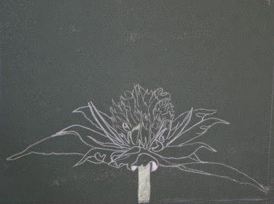
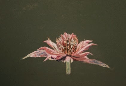
Bee Balm on Dark Green Mat Board


Working on a dark support, you cannot simply save your whites, but have to "come back" to them. Also, to have intense colors, you need to give them support. Here is where we learn why canvases are traditionally painting white Gesso!

You can try and do your fine sketching with traditional pencil, but there is the danger of embossing the support trying to make out dark lines.

White makes a much better sketch. Always use a very sharp pencil and press lightly. If you are careful not to press down, you can erase, or use erasable pencils.

In a drawing like this I will do the entire main or focal point in an underpainting of white. This will allow the greatest contrast with the dark background. White is the most reflective color and will add vibrancy to the layers of reds and greens going over it.

It will take multiple layers to get to any real vibrancy in this painting. Starting with the lightest reds and building up to the darker reds, blending each layer in, first with pencils, blending pencil then with a stump. Layer after layer until the colored pencil more closely resembles an old painting. At times I do use mineral spirits. But more with stump and wax blending pencil.

Even though the background is not the focus of the artwork, it does not mean it is not important. You need to decide just how you are going to handle it, what emphasis it will have. The background not only sets the mood of the piece, but supports the main focus of the artwork. Do not neglect this. The tendency with a dark background is to simply let it go. But choose to allow your background to support the composition.

 
When all is said and done, taking the time to layer in color and to carefully blend the layers of color is worth all the effort.


Monday, April 22, 2013

Final Steps Blending, Highlights And Burnishing


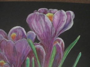
These flowers are more than purple. Like all colors in nature, they are more a blend of color than a pure pigment.


Layers of purples are between layers of white and a touch of red. The stamens are shades of orange-red to light yellow.


Between each layer, I stop and using a stump, blend each layer to the previous layers. I also want to blend the stem of the flowers (purple) to the green stem, shading through white. This is how the flowers grow, and I want to continue this.


I also want to bring back the white highlights on the crocus itself and its leaves.


I do use a blending stick for some of this. This is a pencil that is pure wax. Using it helps two colors of colored pencil blend into each other.


Then I do burnish the entire picture, using the burnishing tool, rather than the paper stump. This brings a nice polish and shine to the drawing. It helps it jump away from the paper.


I really like the contract between the dark paper and the vivid flowers.