Drawing and Painting; Sketching and trying to be an active, working artist, and how they relate to my personae, Starrpoint. That person the web invented
Friday, December 31, 2010
My French Easel: 6 ways your image manipulation software can help you judge your work
Another hint to improve your work. I think this is very valid.
Tuesday, December 28, 2010
The Price Of Selling Art
Should be good news, and it is, but hey, I was not ready to part with that one. Why didn’t they want the other old thing? That was my favorite! I just finished it! I wanted to grab it back? I thought selling my work would be great! Why isn’t it?
When you stop being emotional about your work it is time to stop painting.
Period.
 |
| S. Tschantz Sold |
Of course you have mixed feelings about it! While I was relieved to have sold 3 pieces, I was also sad. I loved those pieces; that is why I put them up in the show!
Never, ever show work you are not 100% proud of. NEVER.
Always show only your best, that which will tear at you to part with. Only then can you be sure what you are offering is really art and not simply decoration. Artwork to be true art must speak to the both the artist and the patron. There should be a give and take in this relationship even if you have never meet and will never meet.
 |
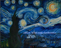
| After Vincent |
Monday, December 20, 2010
The Lament of a Messy Painter-
 |
| The Dungeon! |
 |
| I have been trying to clean it up! |
Tuesday, December 14, 2010
People's Choice Awards
 |
| Fern Counting the Vote |
People attending the Miniature Exhibition are handed ballots when they came into the gallery so that they can select what they felt were the best entries in the Miniature Exhitition. There were to select works in two catagories: Most Elegant Entry and Most Creative Entry.
There arealways tons of worthy choices so it was hard to narrow it down to two.. But choices had to be made.
Counting the ballots was a much bigger job this year, due to the record number of people gracing our gallery with their visits.The stuffed to overflowing ballot box was empited a couple of times before counting, so I know there were lots of votes!
The voting was close, but choices were made.The final tally did reveal clear winners however.
Linda Rossin’s “Elegance in Motion”. The beauty of the rising flamingo captured the attention of the most guests for the Most Elegant Entry Award, while Sandi Worthington’s 1inch by 11 inch “Going To Water” won the Most Creative Entry Award.
I think congratulations are in order for both artists, Sandi Worthington and Linda Rossin on their selection by the guest of The Renaissance Art Gallery for this year’s People’s Choice Awards.
 |
| Linda Rossin's "Elegance in Motion" |
 |
| Sandi Worthington's "Go To Water" |
Monday, December 6, 2010
We are Visual People
People see in a unique way in the animal kingdom.
While other animals may have greater visual acuity, it is not linked to our flexible brains. We see better than our dogs. More important, we perceive better than most animals. Many animals and insects have greater range but they do not always understand what they see. We are geared to question our sight and to act on it.
When an animal is still, it is virtually invisible to many animals, indeed, sometimes to us, but if we move our heads, or look at it out of the sides of our eyes, it may well pop into view.
 |
| S. Tschantz |
The visual arts, ea painting, sculpture and drawing were for a long time considered more common than the higher arts such as poetry and writing. Visual art is non-verbal, so the verbal arts were free to call it names. One reason it was denigrated was because drawing was a demonstratively teachable skill, which is ridiculous, as music and dancing are also teachable skills and no one would argue that they are not true arts. But visual art is non-verbal and vulnerable to name-calling by the more verbal arts. Also, the visual arts have long history of high visibility and usefulness, and that very usefulness was argued against them. Their art was considered lowly, a mere craft.
So there is a separation in the arts between the visual and the verbal.
Monday, November 29, 2010
My New Easel
 |
| New Easel next to old one |
Most of us can’t afford to outfit our studios with top of the line materials and furniture.. What we can scrounge is what we have to live with.
Even a space to paint or draw is a luxury for most. Calling the space we carve out for ourselves a studio is giving grandiose important to that corner of the dining room or closet in the spare bedroom. For some this means a simple tabletop easel or the ubequdeous “student easel”, that cheap pine stick easel. You know the one, the folding tri-pod with the wing nuts.
That is what I have for years and years. Still have two in the dungeon. They hold a canvas at least as large as I usually paint. But these easels--for all that they are called “student” are hard to move around, and not particularly sturdy.
Much better is my aluminum field easel I invested in a couple of years ago when I start to teach and paint plein aire. It is collapsible and comes with a nice carrying case. This easel is ideal for moving around and has separately adjustable legs. And it holds the smaller boards I use plein aire easily. It is also handy for figure drawing class.
But back home in the studio, it was the pine-stick easel or nothing. Oh for a real studio easel. Something sturdy and that gives firm support to really large canvases or even boards!
This past year I got my wish in a surprising way; as a gift from my older sister. Now getting a gift from her is not in itself unusual. I don’t want you to think she is mean or anything. But she is a non-artist and freely admits to knowing nothing about art and art materials. Nothing at all. She did not even know the word easel, it is that stand-thingy.
My sister (with my mother) is a committed (or should be committed!) garage-saler. They approach garage sales with almost religious devotion. But as I said, she admits she has no idea what constitutes a good art supply or materials. She also have no idea about prices or values of such things.
But she is not one to let a little thing like lack of knowledge stand between her and a good deal! When coming upon a garage sale of a woman moving to smaller quarters she spied a number of things that kind of looked like they might be used for fine art? She fearlessly negotiated a fabulous deal!
Not only am I now the proud owner of a large aluminum studio easel, but a zippered, rolling craft cart/tote to hall things back and forth to the gallery for my classes, and a craft case designed for scrape booking, but perfect for holding a nice stash of art papers.
Monday, November 22, 2010
A Work of Art
 |
| Boat At Kanawha Falls S. Tschantz |
| Pony S. Tschantz |
Monday, November 15, 2010
Successful Paintings?
 |
| Failed Fall Painting |
So don’t be afraid of failure and of creating “interesting” paintings.
None of us likes everything we do. Not if we are honest and not a complete egoist, that is.
If we don't fail from time to time we don't make progress and out art becomes repetitious and stale. So don't be afraid of failure or of painting "interesting" paintings. These contain the germ of genius.
Thursday, November 11, 2010
Seeing What Good Is
 |
| Geraniums in Terra Cotta Larry Bragg |
We tend to look at things myopically, only what is right in front of us. This show has knocked me down to earth. It is a real eye-opener. The artists who entered the 10th Annual National Miniature Exhibition shows you just what GOOD is!
Now this could have been crushing. Really. Seen next to the rest of the artwork, my work is well….midland. Not really terrible, but not so great that it warrants a second look. It would be easy to say, “Oh, I can’t do this!” and give up. The stuff in this show is really, really good! But this does not have to be your reaction when you are confronted with genius.
Let me tell you what one artist said to me at the reception for the 10th Annual National Miniature Exhibition. Larry Bragg—a first time exhibitor in miniature said the scope of work was inspiring and showed him just what was possible. Already he is anxious to start on next year’s work. Looking at the excellent work hanging in the gallery, all he could say was: "Wow! This shows me what can be done!". Far from being discourage, he is inspired! His excitement when he saw the wealth of fine art was amazing. He can't wait to try his hand at something new. To explore his new found knowledge of what is possible.
 |
| French Table Larry Bragg |
PS. I promised last week to post the link to the Renaissance Gallery's 10th Annual National Miniature Exhibition so you can all see the photos of the reception.The Renaissance Art Gallery
Monday, November 1, 2010
My Miniatures
 |
| Waterfall 1:x2" oil painting |
Yes, I entered. Not that I will win any prizes. I am simply not that good with miniatures—yet.
But I am working on it.
I did 3 colored pencil drawings that I entered along with an oil painting and two mixed media works.
 |
| Conte on Acrylic |
I do like the larger butterfly. That is also a mix of watercolor pencil and regular colored pencils. While the larger one is done actual size (this is allowed for things naturally small) the other is quite a bit smaller than the original butterfly.
I will be posting more photos from the miniature show on both the gallery website and the galleries facebook page.
Galleries website
Facebook Page
 |
| Nude in mixed Media |
Monday, October 25, 2010
Fellow Artist, Lillianne Bowersock
 |
| Lillianne |
Actually, we were all excited and happy for her. But hey, I am not going to loose the chance to grouse!
Back to the story, Lillanne was of course really excited! She came into the meeting for The Renaissance Art Gallery all bubbling and waving the ticket around etc. Of course, she apologized for going at this time, but hey, family counts.
Lillianne has sleep apnea, and must use a breathing device to sleep. And she had to make special arrangements with the air lines to use this device on the over night flight.
Monday, October 18, 2010
Size Matters, Working in Miniature
 |
| Monarch, Colored Pencil S. Tschantz |
But choosing the size is also a part of composition. So go small!
Small works can be surprisingly intimidating.
How Do I Paint So Small?
Once you try a couple, you find it really isn’t that hard. With the correct tools and lighting it can be very relaxing. After the stress of painting large, there is a certain freedom in going small.
4x6 seems to be the most popular size, both with artists and with collectors. This seems to be small enough to be intriguing, and still allows the viewer to interact with the scene. Another plus-it is a standard size and relatively easy and inexpensive to frame.
 |
| The Photographer - graphite S. Tschantz |
Monday, October 11, 2010
Second Figure Drawing Class
 |
| 3 poses-gesture drawing |
But someone has to run the gallery!
 |
| Toned Paper Charcoal Sketch |
What Class Is Like
 |
| Model's View |
 |
| Final pose |
Monday, October 4, 2010
Buying Produce
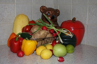
Produce seduces me. I hear its siren call. The shapes and colors screams – ME - ME - ME, BUY ME!!!!!
I find peppers a joy. They entice me with their colors and shapes. Large, small round and crooked. Purples so dark as to be almost black, yellows to rival the sun add in tomatoes and you have the making sof a great salsa or a wicked still life.
You see—I am an artist. Everything I see suggests a painting or some other work of art.
This week I succumbed to squash. Heavy bodied winter squash. Butternut, acorn, spaghetti and turban. The hard shelled winter squash come in such a range of shapes. Have you really looked at a Hubbard? I just love the warts! And don’t get me started on gourds. I look for the perfect size for my small family, but also for its looks. Even though they lack the bright colors of summer fruit, their shapes do make up for it. Add a pumpkin and you have it made!
At home, they get stacked on the counter. I can’t simply let them be. Before they are eaten they must be painted.
Monday, September 27, 2010
Life Drawing Class
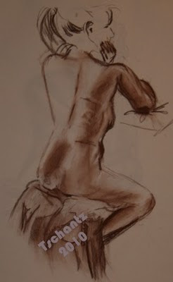 First Saturday
I have been struggling find time and the will to make art myself. Oh, I teach, and do a lot of drawing there, but with trying to promote the gallery and working on the upcoming Miniature Exhibition, I frankly, had not take the time to do art for arts sake. There is always something more pressing to do. The house is dirty, the plants need attention, etc, etc, etc. I had almost talked myself out of it again last Saturday.
Figure drawing started up again last Saturday after the summer hiatus. As usual, I find myself fighting depression and feelings of being a fraud. I almost scared myself into doing something “more important”. This time I made myself go. I needed it.
It was good to get back to basic—real live drawing. First pose lasted a bit more than the scheduled 20 minutes. Gary, one of the other artists in our artist co-op takes charge of timing and lighting. He brings on of his spots from his photography, and kind of oversees the pose.
Thankfully the oppressive hot weather seemed to break by Saturday, so the gallery was comfortable. We still needed the little fan for Lynn, our model, but we were able to turn off our loud, stand alone air conditioner. One of the drawbacks of being in an old, historic building is old pre-central air wiring!
Support and Media
I was really Interested in the different approaches by the artists. Most of us use large sketchpads, spiral bound to keep the pages together, but not all. There were several newsprint pads as well as one artist who brought a box of full size drawing paper sheets. These sheets or pad were put on easels, but one artist brings a more manageable size pad, which gives her the freedom to walk around the room for just the right point of view. Since she works off a pad she can comfortably hold, she is not tied to one spot.
With this variety of formats is a variety of media. While everyone has an array of pencils, other media is also employed. There were charcoal pencils, vine charcoal sticks, pens, pencils, colored pencils, conte’ and water media. One artist routinely “sketches” with watercolor washes.
There are 5 more Saturday s of figure drawing and I hope I can make several. It is my day to “sit” the gallery next Saturday, but I will bring a small pad, and I will be there to help check in work for the Miniature show the weekend of the 22nd, but I hope to make the others. If so, I will post some of my sketches.
The feel of the conte in my hand and not being the one in charge for a change. I could simply draw.
Monday, September 20, 2010
Crafting supply tools
Friday, September 17, 2010
Sunday, September 12, 2010
No Derivative Works Please
A derivative work is defined as one that is substantially derived from another underlying work. The dictionary also notes that such a work, when based on a copyrighted work is an infringement if permission is not obtained prior to execution. Understand? No. Well if you can tell where it came from, it is a derivative work.
This used to be quite common in artwork. All over the world you could find these works and art historians could trace their origins. With the establishment of copyright, and intellectual property, it is now a definite no-no.
Fair Use
Well, what about fair use, you ask. It truth, fair use has nothing to do with creating new works of art, which collage artists around the world repeatedly fine out. This clause in the copyright laws is actually meant for critique and publicity. Reporters and critics covering art shows and doing book reviews, etc, can show snapshots of or include excerpts from works and shows they are reviewing. It was never meant to say you could take parts of other works and incorporated them into your own work. Most shows do include a clause in their prospectus explaining that images can be used to publicize that show or gallery. This is also fair, and does not effect the actual copyright holder’s integrity.

When is reference not reference?
But I only used that photo for reference in my painting, isn’t that fair? Well is it? Why did you use that photo? Did you copy the layout of it? Mimic the colors and lighting? Use the same stances of the people?
Dictionary.com defines reference, number 8 as: “use or recourse for information”. This is the meaning that our reference photos should have.
I am doing a painting with a horse, oh; I need a picture of a horse so I know how many legs a horse has. You should use those photos for information only, the actually composition of your painting must be your own if the painting is to be submitted to any show or competition.
If you copy the composition of a photo, you are copying the photographer/artists work, their artistic vision. There is a huge temptation to do this. We all have calendars, books etc, that contain photos we would love to copy. But remember, this makes it a derivative work.
When is a derivative work not a derivative work?
Well, all I have to do is change 10% of it and it is my own. Or simply reverse it. Where this myth came from I don’t know. But it persists. Not true, people. Simply change a few things around, reversing the photo, etc. does not mean it is ok to copy. How do you know the photographer did not reverse the print before it was published? And there is no truth to the 10% rule at all. If you can recognize where it came from, it is copying. And don’t think simply doing it in another medium makes it ok. It does not.
Now there is definitely a difference between derive from and inspired from. One is totally based on the previous work, the other has it own composition, style, texture, etc.
Royalty Free photos on the web
There are tons of sites on the web to view and download photos. Read the fine print. Even on the stock photo sites, these works cannot be copied for artwork. The fine print even states that you cannot use these for derivative works. If you find a photo you like, you must get permission in writing from the photographer to use it. The site you find it on may or may not be the site of the photographer, and I would be cautious of any site that does not protect or mark the photos. Many websites unfortunately, make free with photos, drawing and paintings found on the Internet. Yes, Virginia, things on the internet are covered by copyright laws.
Thursday, September 9, 2010
Open House

Saturday, I will be attending the open house for Arts resources for the tri-state. This fine art group serves the areas of West Virginia, Eastern Kentucky and Southern Ohio. Each year they sponsor a series of fine arts classes for young people in drama, dance, visual arts and more. This Saturday, September 11, 2010, there is a preview and sign-up day. All the teachers for the programs will be gather in the old High School Cafeteria, now the ballroom ( and you should see it!). They will be there to answer questions, demonstrate their programs and general enrich your lives. Many of the teachers do take on adult students too, so everyone can come. The Open House Starts at 2:30 but who knows when it will end!
My own classes are for Fine Arts, Painting and drawing. The Junior class focuses on drawing as the foundation of visual art. I like to take the students through the process of developing their artistic vision. Right now, the class is focusing on the human face, which is one of the first things people try to draw, but using this to develop powers of observation. But I will also be helping them develop a sense of composition and color. We will be having sessions that include Chinese Calligraphy, ink wash painting, some watercolors and more. With each session I do include some art history that flows naturally in with what we are doing, including some interesting aspects of American history.
The arts in our children’s lives are very important. It is a fundamental to a well-rounded education, and helps in all areas of learning including reading, math and science. Art teaches problem solving. These courses are a wonderful supplement to their education.
If you are in the area, stop by The Renaissance Art Gallery and the Renaissance Art Center.
The Arts Center website is here:
http://webmail.suddenlink.net/do/redirect?url=http%253A%252F%252F733arts.org%252Ffineartsschool.html
And this, of course is us!
The Renaissance Art Gallery
900 8th Street, Suite #20
Huntington, WV 25701
Gallery (304) 525-3235
Appointments: (304) 453-3187
gallerywv@yahoo.com
www.orgsites.com/wv/renaissance
http://twitter.com/wvgallery
http://renaissancegalleryart.blogspot.com/
Gallery hours are:
Friday & Saturday 12-4 pm, Sunday 1-4 pm
Studio hours Monday 10-Noon, Wednesday 1:00-7:30 pm and Saturday 10-Noon
Monday, September 6, 2010
the Value of Value
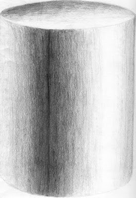
How do we get our drawings and paintings to look 3 dimensional?
Value!
This is the subtle manipulation of color that tricks the eyes into seeing a flat object (such as in a drawing or painting) as having depth.
How do we do this?
1.) Decide on a light source, ea, where is the light coming from and how strong is it. It is easier if you light your still life this way, but you can exaggerate what is there.
2.) Notice any light or dark areas, and exaggerate this a little
3.) Make sure your objects are "grounded" so they do not appear to be floating. All objects that are sitting on a surface have a very thin dark line at the bottom. All objects. This is where the object meets the surface. Do not forget this or the object will be floating in space. You might not notice, but you will notice the object just doesn’t look right. You might start looking for structural defects, not realizing the only thing wrong is this missing dark highlight!
4.) Don’t forget highlights. Very often your darkest shades need to be right along side the strongest highlights.
5.) Remember light bounces. We are talking about contour shading here. This happens with all colors, not just black and white.
People wonder what simple tricks to use to make their work look dimensional. They are looking for shortcuts. Some magic trick. Sorry to disappoint you, but it takes work. Hard work and attention to detail.
Drawings are the result of hard work and study. This does not need to be formal, but it is necessary for you to study what you want to draw.
This does applies to "drawing from my head" work. Because you are using your imagination, it is no excuse not to use your understanding of the real world to compliment and reinforce your imaginary one.
Use value to make your images come alive.
Sunday, August 29, 2010
Derivative work
My work is based on what came before me. I looked at artwork. I saw what was there and was inspired by it. My mom was always buying prints of great artwork. These were all over my house growing up. Later I did take art and craft classes. I studied anatomy, and along with drawing from life, I saw how other artists before me and around me solved the problems of rendering the image of the live figure onto paper.
Being inspired by classic artwork is normal. Often I will encourage new students to spend time looking at and even coping some of the great masters. It is an excellent way to learn to paint and draw. This used to be quite common. Touring art museums, you would see students painting or sketching from the paintings on the wall. Since 9/11, most places don’t all
 ow this anymore. Nor do most they allow photography, but that is another subject.
Are these derivative work? Well, of course they are. As you gain more and more experience, your own work will diverge more and more from those of the masters. One of the first paintings I ever did was based on a Normal Rockwell poster. I was new, and did not know anything about copyright, and I would never display this, but I learned a lot. But I no longer try to paint this way. I no longer feel the urge to copy. And as you progress, you should get away from copying others and do work based on your own esthetics's.
One artist I know, selects a new artist each year to study, to work from their work, and learn their processes. What she learned can become part of her own artistic psyche. This work is done only for self education, and does not become part of her portfolio or ever make it to display. It is a way of stretching her artistic muscles.
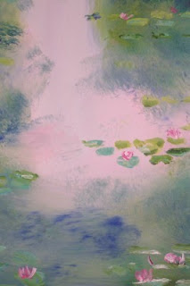
I have done this myself. I love Monet, especially his earlier works. After seeing a traveling show of Monet canvases, I and several of my students did our own version of one of his water lily paintings. Can you tell these are based on Monet’s paintings? Well. It is hard to do any water lily paintings that does not harkens back to Monet. Water lilies are so closely co
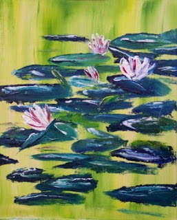 nnected to Monet that any water lily painting will be compared to his. I have done other water lily paintings that are not based on his water lilies but on my own photographs of water lilies taken at Longwood Gardens. But it is enviable that it will be compared to Monet. The first may or may not be recognized as a derivative work. Frankly, I have been painting too long to copy well. And I never was that good at copying others work. The other is not. It is clearly my own work.
Monday, August 23, 2010
So here we start
Saturday, August 21, 2010
Entering Shows Part 5- Dating the Show
Take careful note of when the show is, and also when you must submit work for consideration in this show. These are usually two different dates! Also note the format for submitting work. Traditionally, in juried shows the artist must submit photographic slides of their work, but more and more are accepting digital files. Still, you need to make sure you submit the right format and size to be considered. Do not assume that your work is so special that they will accept whatever you choose to submit. This is not only wrong, but also insulting to the sponsoring organization. Not the way to make a good first impression.
If the show has a theme, make sure any work you submit fits that theme. Do not try to shoehorn it in. If it does not work, it does not work, no matter how much you like that particular piece. If you want to enter that show, do something else. Also, make sure it fits other criteria for this show. Some shows emphasis a single medium, such as watercolors, while others exclude certain media, like photography or collage. Submitting work that are illegible for the show not only wastes your time, but frustrated the sponsoring organization.
Nothing upsets me more than having to turn away work from an artist who has driven 40 miles because the show they are trying to enter restricts work to only a certain medium or theme. This past spring, we had to turn away some really good photographs because the spring fine arts show did not accept photography; photography is reserved for the summer show. Sadly, the artist did not re-submit the work for the summer photography show. Reading the prospectus would have save them a trip at the wrong time, and allowed them to enter the correct show.
I hope this information is helpful to you. And if there is anything else I can help with, please let me know.
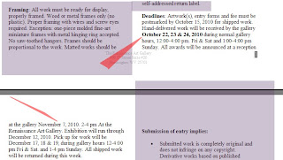
I know that people who orgainize these shows really hope for a good turn out, both with submissions and people viewing the show. When you enter, mark your calendar to attend the opening. A lot of people attend these to meet the artists, so attending is important to both the show and to you.
Monday, August 16, 2010
Delivering your work. Entering shows Part 4
Some shows and groups are rather strict on this, and being either too early or too late will disqualify your entry. Also, some larger shows can have several different delivery/ship addresses. These may or may not be the same as the location of the actual show. I know of one larger miniature shows (I know, a large miniature show sounds like a counter diction in terms!) that has a long list of delivery/shipping addresses depending on your last name! If you last name start with an A-E, you send to one address, etc. Others, will divide things up by category, portraits to one address, landscapes to another, etc. None of these addresses are
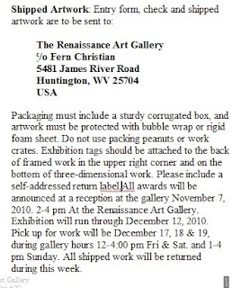 where the show will hang. That is another address. You need to be clear on this, also on when to either bring in your work or ship it. Volunteers staff most of these shows run by art associations. And the addresses may be only temporary shipping addresses so timing can be important. Also, these groups may not have their own buildings but depend on other groups or locations for their shows. These can range from real estate offices to banks, local museums and even government buildings.
Read the prospectus closely for this information. This might sway your decision to enter this particular show. If at all possible, you should plan on attending the artist’s reception. This is your chance to mingle with other artists and patrons. The group putting on the show will work hard at getting press coverage, and this is also your chance to come to the attention of the public. Don’t be shy! It is your time to shine, whether you win a price or not.
Another thing I want to bring up. Pick up your work on time. There will be a location and time frame listed, usually in the prospectus, but certainly when you drop your work off. Be sure to mark this on your calendar. If the group does not have its own location, failing to pick up your work can put it in jeopardy. While every group will try to take good care of your work, if you fail to retrieve it, well, anything can happen. If they have no actual location, it will no doubt be left in someone’s storage room. More and more shows are stating the consequences of failing to retrieve your work. You would think this would not be a problem, but it is not uncommon for us that The Renaissance Art Gallery to have work for over a month after a show comes down. This is a burden on us, because we have a new show going up, and lack any substantial storage space.
Groups without a location may even dispose of unclaimed work. This is their right. It is your responsibility to collect your unsold work.
Of course, if your work was shipped, this is a mute point. You have provided a carton and label for return shipping and should have no problem getting your work back.


