Monday, June 5, 2017

Critique: Small Round Pot


My niece sent me a snapshot of her sketch of a small round pot with the text “drawing round things is hard!”


I can see that she had trouble with this.


Why?


Well, its not uncommon to have trouble with any round symmetrical object, or any asymmetrical object for that matter.


It can be hard to keep focused on what you actually see. The brain has a tendency to “fill in the blank” even when there is no blank.


The problem here is with the “math”


Her “measurements”   don’t add up.


I can tell from the sketch that there were a lot of false starts and more than a bit of erasing.


This is one reason some drawing teachers have students practice drawing with a pen rather than a pencil. No erasure allowed. When we erase and redraw over and over we tend to get frustrated, and things get bigger. More “incorrect”.


I also see that she got distracted by the shadows and the patterns on the vase. Distracted too soon by details she lost the overall shape of the object.


If you look at the pot, you will notice that it is almost twice as wide at the top than at the bottom. Also, at this angle, the opening of the top of the pot is almost 1/3 the overall height of the pot.


What would have helped?


A couple of things.


One, a plumb or center line. Do not be afraid of putting guidelines in your drawings and sketches. These should be light lines easily erased. You can use a straight edge, but really any reasonably straight line will do. Putting in a horizontal base line to indicate the bottom width and a wider horizontal line for the top of the pot would also help. This would automatically give you guidance for the correct slop. You can see that she has her sides almost straight. The pattern got in the way.


Don’t worry about any pattern when sketching out the shape. This is not important at this point.
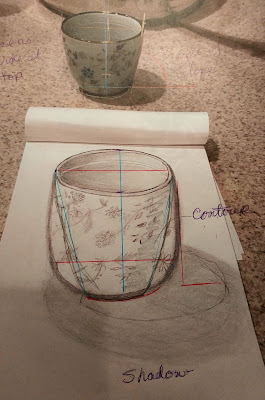
 

The strong shadow also became too important. Because of the focus on the cast shadow she did not discern the contour shadows.


I can see the growing frustration in this sketch.
 
Rather than going on and on. I think some sketch lines over her drawing will say it all. I have added a couple if guidelines to this sketch showing how easy the use of centerlines can help.


Relax.


Try again.


Monday, May 29, 2017

Now For The Critique


My niece has just started to draw

--so I suggested she try to draw white objects and drawing from life, not photographs.
Her drawing of a spoon.

I am going to post copies of my niece’s drawings. Remember, these are her first drawings. 

Working from life gives you a very different point of view. Yours.

In art only one point of view matters, the artist’s or yours.

When drawing try not to move around a lot. You will naturally want to. We all want to see what is around the bend. This will give you access to more of the object, but as you move around, you will find inaccuracies and distortions creep (or leap!) in your drawings.

This is what happened here.

When drawing the oriental spoon, Niece tried to draw more of the bottom than what she was seeing. This is natural, as your brain knows that the spoon need to hold the soup. She was also distracted by the pattern that was on the bottom. She brought the pattern up onto the side, where it is more easily seen. We tend to focus on patterns so she might not even realize that the pattern is confined to the bottom. She also shows a bit of the white which she would not see in the spoon at the angle she has drawn it. It is always tempting to add what we know, but restrain yourself to what you are actually seeing at the moment. 

She has also drawn the bottom of the spoon completely flat. While we all know it is flat, it has to be to rest easily on the table, we DO NOT SEE IT THAT WAY. At the angle she is drawing, we see not the flat bottom but a slight gentle curve. 

The sides are a bit wider than the bottom and we can be deceived by that curvature.  Both sides are the same height, we know this in our heads, but what do we see? Because we are looking at the spoon at then angle, what we see is that the back side appears to be taller than the front. In our heads we know this is not so, but THIS IS WHAT WE SEE. 

Sorry did not mean to shout, but look carefully. Because we are looking slightly down on the spoon the sloping side closer to us appears smaller, as it slopes away and down from our vision. The opposite side because of the angle appears larger because it is sloping up and away or outward. We actually see more of this side. Also it is well lite and appears lighter. The side closer is sloping down and under and is darker because of the shadow cast by the upper edge. This surface has both a cast shadow and a contour shadow. Which is why it is so dark. The spoon is actually a uniform porcelain white. We also see contour shadows on the handle which is concave. There are also highlights when the lamp is glinting off the smooth porcelain. We also have strong lines where the top and sides meet. These can be softened. You only see a slight blur where the contour shading begins. A minor detail, the handle at this angle is a little short. I suspect that niece turned her head a little.

Does this mean this is a terrible drawing?

No. We can all see what it is. Most people would be amazed at how accurate it is. It is a fairly accurate drawing of a white porcelain Chinese spoon. Very good for a first try. But a good critique gives the artist something to think about and strive for. Knowing niece. I know she can do better and will with experience.

Drawing is like any other skill. It takes time to get really good at it. Time and a lot of practice!

We learn to draw by drawing.


Monday, May 22, 2017

Drawing White Objects


Notice the shadows
My niece has just started to draw--so I suggested she try to draw white objects and drawing from life, not photographs.

Why White?

One of the best ways to do this is to draw simple white objects against a white background.

Why?

  1. There is no distracting color
  2. There is no distracting pattern
  3. You can see value clearly
  4. See how shading shapes an object
  5. learn the temperature of white
  6. Understanding the difference between contour shadow and cast shadows

White is Not Always White

Notice the contour shadows
When we think of white we think of the absence of color. Not so! Have you ever gone looking for white paint in a paint store? How many shades of white are there? White has color. Actually white has all of them! But lets not get into that. White also has temperature. There are warm and cool whites. Whites that tend towards the yellow, whites that tend towards the blue. How does this effect drawing with graphite? Even a white egg will have value shifts in its contours.

See all the shades of white
While it is a challenge to draw, using white objects against a white background will teach you more than almost any other drawing exercise. Drawing these from life will help you focus on their true shape and size. Working with a couple of similarly white objects will also help you learn to evaluate relative size, placement and even texture. One of the classic drawing exercises used for many years in drawing classes the world over is drawing a white bowl of eggs. Or a simple grouping of eggs on a white tablecloth. Many an art student remember this and shudders! 

Simple shapes are not simple
Also by drawing white you are not deceived by differences in color intensity nor distracted by pattern. When you are first learning to draw ( and even after if you are honest) you will find different colors will catch your eye first or distract you from other objects around it. This is natural. We all have our own color preferences and sometimes dislikes. When you are using a monochrome media, like graphite, interpreting these colors into a value rich drawing can be both rewarding and a little confusing. Learning to judge which red is brighter, lighter or should be more value rich then the mustard yellow or purple can lead to really exciting drawing. Learning to focus also on the contour shading of an object, seeing the small value changes in a solidly colored object will help you draw that Chinese vase so it looks real, round and almost popping off the page instead of like a flat cutout.

Where are the edges?
To draw well, whether it is hyper-realistic or fantasy, abstract or cartooned, you need to understand the difference between cast shadows and contour shadow. You can read all you want. You can copy master drawings, use photographs, but until you do it yourself, from life learning to make your own judgments, you will not really experience the whole joy and freedom of drawing.


Learning the technical side of the art is freeing. Just as learning the scales when learning to play an instrument gives you the muscle memory to move with the rhythm of the song learning to see the contour shading frees you to draw what you see accurately. This makes it easier to manipulate objects when you want to. Understanding them helps you turn them inside out and create believable imaginary objects.
All white but not the same color


Wednesday, May 17, 2017

This is a Critique Not a Criticism.


A critique looks to analyze. Yes, it will point out the “faults” or something like that. But it is not supposed to slash, bash or trash a work. But to look for both the good and bad. The point of a critique is to improve. Not just the artist who is being critiqued but those that look at the artwork.

Learning to critique both your own and others artwork can help you as an artist and patron both improve your own work and your appreciation of artwork in general.

So this is a critique.

There is a lot of misunderstanding about critique. And this is perpetuated by a lot of “art classes”. So often students are made to feel that they must find something wrong, something to criticize and denigrate in a work of art.  Honest evaluation and analysis is essential, but active bashing of the art and artist is not.

“If you can’t say anything good, don’t say anything at all”

While this is good manners, undeserved praise helps no one. Honestly is needed here. It is not necessary for a person participating in a critique to have all the answers. Sometimes simply listening to the artist is an amazing amount of help. When a piece does not work, and the artist knows it, putting your finger an just what is wrong is harder than you think. Helpful, tactful suggestions can unlock the artist’s creative view and lead to a solution. Or even another leap of creativity.

OK, enough preaching.

This is a critique.


My niece, a lovely, talented girl (she gets it from me) has recently discovered painting and drawing. She was invited to attend one of those wine/cheese paint a picture parties. While everyone had a good time, something for her clicked.

First Painting
But she also recognized that these parties, while fun, did not offer enough. I encouraged her to simply get a few pencils, a sketch pad and draw. Draw from life. Simple everyday objects.  Preferably white.

Now, those of you experienced in art know the value of drawing white on white objects. Many of you have fond/hateful memories of drawing a pile of eggs or marble busts in school. We all did it. But there is no better way to actually see what you are drawing, undistracted by color, pattern and texture. White on white helps you see the contrasts and values that make up and object. You start to see both cast shadows and contour shadows that you might not have been consciously aware of before.

So here is the critique. Niece texted me a simple drawing she did of a white oriental spoon. In the photo is the actual spoon.

First Sketch
Now for a first effort this is rather good. She placed the spoon on a white cloth. 

I have never been an advocate of the harsh
critique. Or as I call it, the drill sargent,s technique of critique. I am not preparing anyone for war so why act like it. I also find harsh criticism unhelpful. The point of critique is improvement. Anything that totally discourage or eviscerates a person really is not helpful.

The point of a critique is not to elevate the person giving the critique but the person receiving it.

Sometimes in schools or in groups people are made to feel if they do not point out “mistakes” or they cannot put others work down, it somehow lowers their own work. We do not advance by putting others down but by improving our own work. When you undertake a critique it should also reflect and result in improvement in your own work.


Monday, May 15, 2017

Giving A Critique


When asked to give a critique, do you suddenly feel intimidated? Put on the spot? Almost exposed?

I could never do that! Why what would I say? I could never be mean!

I could never be mean.

That is the crux of the matter. The idea that critique is or should be “mean”. That only harsh criticism is real critique.

Well, it isn’t. The really harsh stuff seldom does anything other than make the giver feel superior.

There is a body of thought that truly believes that tearing someone down is the best way to build them up, make “real artists” of them.

What it does do is rip them apart in an effort to remake them in your image.


So when asked to give a critique, remember it is not a criticism. Look for both good and bad. Encouragement and suggestions. But remember they are only suggestions.

Each artist must work to their own vision.


Monday, February 13, 2017

Brookgreen Landscape


Brookgreen Gardens is in South Carolina. It is a wonderful place to stroll among beautiful plants and art. It started as a sculpture garden and still displays sculpture among the many exotic planting. It also has a zoo of farm and native animal.

The price of admission is good for 2 days, and you are welcome to come and sit, sketch and photograph anywhere and for any length of time.

Well worth a visit if you visit the islands along the coast of South Carolina.
 

Monday, February 6, 2017

Many shades of Gray.


Working on this heron, I am using many, many grays.
 

Working on my Lesser Blue Heron, I am constantly reaching for gray pencils. I have a lot of them!


Working Definition of gray:
adjective, grayer, grayest. 
 
1. of a color between white and black; having a neutral hue.
2. dark, dismal, or gloomy: gray skies.
3. dull, dreary, or monotonous. 
4. having gray hair; gray-headed. 
5. pertaining to old age; mature.
9. any achromatic color; any color with zero chroma, intermediate between white and black. 
10. something of this color.
Cool Grays


In art, gray is anything but dull. It is essential to any painting. You cannot work without gray. It is what gives life and depth to any 2-d artwork, what makes it pop or look real.


Far from being neutral or dull, gray comes in a wide variety of hues and chroma.


The definition of Chroma:

1. the purity of a color, or its freedom from white or gray.
2. intensity of distinctive hue; saturation of a color


But gray has its own intensity and saturation of color. And it does come in colors! Any pure color can and does have its version of gray. Warm, cool, French etc. I have a beautiful green-gray and a very useful rose-gray. Purples lend themselves to fantastic grays. Ask any floral or landscape artist how they could work without creating the essential grays. Same with portraits.


One of the things that makes both graphite and silverpoint beautiful to me is the vibrancy of the gray tones.


I love gray.

 
I could not draw or paint without it. Each time I create a painting I am mixing a new, exciting shade of gray.


And right now nothing is more popular than gray. Look at the color charts in any paint department. Gray comes in more than 50 shades and each is beautiful.


Lots of grays, from French to warm to cool.
 

Tuesday, January 17, 2017

Landscapes in Colored Pencil

I see a lot of colored pencil drawings/painting both from artists friends here and others that I have made through the internet. Most are beautiful and most are of single subjects, still lifes or portraits. Few are landscapes in the tradition of the masters.


Color pencil simply seems to lend itself to find detail of a single subject. A flower a beloved pet or the arrangement of objects.


Doing a landscape in colored pencil is less common.


Most I do single subjects in colored pencil. I seldom construct a complete picture, something with a background, mid-ground and foreground. I have to wonder why.


I am working on a landscape in colored pencil right now. It is of a scene in Brook-green gardens, a public garden in Myrtle Beach, South Carolina. It is giving me fits. I am simply not used to working on a complete painting in colored pencil.


But I am finding that I must approach it as I would an oil painting. Even the way I hold the pencils is more like a paint brush, less like a standard pencil. So I am making brushstrokes with my pencils. Blending the colors as I would paint on a canvas.

Tuesday, January 10, 2017

Are you afraid of the darks?


Sometimes it can be intimidating to lay down that really dark layer. Afraid to go too dark. Even when you know, when all your artistic senses tell you that the dark is correct. It still can be difficult to commit to that rich full dark pigment.


While I don’t have as much trouble with this when I paint with oils, with colored pencil or any medium that you work light to dark I have trouble laying down the darkest colors. Without these rich tones however, you lighter hues just are not as rich and full as they need to be. With the truly well developed darks the entire piece will be flattened, monotoned and uninteresting. Unfullfilling. Without the darks the lights lack sparkle.