Monday, March 17, 2014

Drawing with Colored pencil-mixed media


A Tale Of Two Paintings


Started a third colored pencil painting to complement the magnolia paintings. Some format for a different flower. While the magnolias are huge, the third was a much small bloom, but still dramatic. I wanted to do a bee balm, a flower many people react to more as a weed than as a valuable plant. However, it was to be on the same dramatic scale as the magnolias.


sketch in WC Pencil drawing 1
But unlike the magnolia flowers I started with white board not dark green. I thought I would work more with the watercolor back ground than with the other two.

I started with a lot of enthusiasm, but as I went on, I began to think I had made a mistake.

Especially when I got to the watercolor background I was not very happy with it.

 I worked and worked and worked, but still felt dissatisfied.

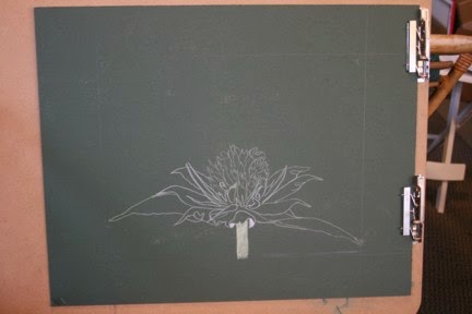
So I started over on the green board with a white colored pencil drawing. This is much more like the first magnolia drawing and gave the more dramatic effect, I thought, that I wanted. But I still worked on both drawings, and as it went along, the first one developed independently from the first two.


Second start.
While it does not necessarily relate to the magnolia drawings, it is beginning to stand on its own. Each piece has its own merits. Neither is perfect. Art does not need to be perfect.

That is not the point. But does it convey what you are going for?

Each of these starts with the same premise, and both break the "don't center it" rule.


This is intentional. It does make for a little discomfort in viewing which I think creates the "look at me" look. These drawings focus on bee balm just after peak. When the flower is starting to fall apart, and the seeds are just starting to form at the base of the blooms' tubes. While they appear very detailed, they are not, with only suggestions of the future seeds. The heads are darkening and the leaves are beginning to loose the green color, revealing the actual pigmentation of the plant. Now the second, with the darker background was more what I envisioned, but after both were done and matted and framed. I think the 1st one, mistakes and all is the better picture.  What do you think?

Green background, finished


1st drawing with washed in background.


Monday, March 10, 2014

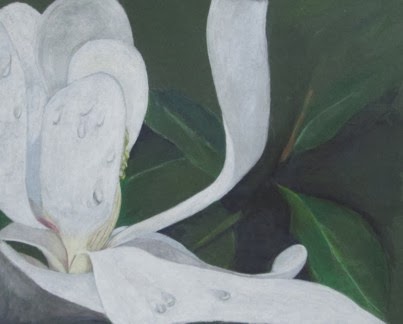
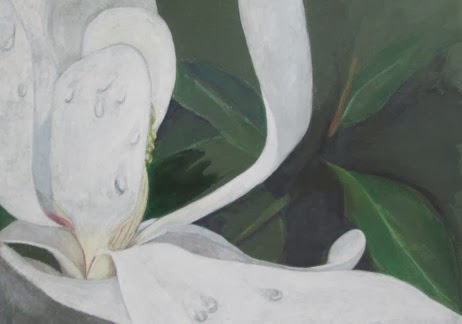
Second Magnolia Drawn and Polished

Finally finished my last magnolia drawing.

I thought I had finished it last week, but the more I looked at it, the more I was dissatisfied with it.

It was not bad, just not finished the way I thought it should.

Still did not have that bright contrast between the white blossom and the dark green leaves.

Even the "final" polish did not give it the strong look I wanted, so I sat and stared at it.


Evaluating your own work is one of the hardest things you will ever do.

Looking critically at it, I saw the shadows just were not strong enough. Now, this is a white flower, and my left brain kept telling me, "its white, what do you want?" But it was not 100%.

I did work on intensifying the white, but it just did not come together. So I decided to attack the shadow.

Using 70% cool gray on the bright sunny white was one of the hardest things I ever did. But it was necessary. Without the darker shadows, the white just did not look white enough.

So something to remember, White is never white! It is the most reflective color and will always pick up its surrounding color and will totally change with contour and shadows.

Now, with an additional 5 layers of blended color, the work more closely resembles what I saw in my head.

Monday, March 3, 2014

Working With Powdered Graphite

New purchase:  a jar of    powdered graphite.


For me a new idea.


Now what to do with it?


Start with a simple sketch, but soon that jar of graphite powder was calling me. A small round watercolor brush and a large rough boor flat and I was starting to experiment.


Starting with a face with powdered graphite.
 

I did use more than powered graphite, I used a 6B pencil to find the placement of the eyes and chin, and lightly sketched with a 2H pencil.


I have a stump of a 4B woodless pencil. I find this useful when I am thinking a lot and sketching. As well as my supply of graphite sticks. These are squares of graphite. These when used on their side give uneven marks, which I used for the foliage. When you use these, you cannot use them like conventional pencils, you need to change the way you hold them and this often changes the way you approach your work. This can lead to both a looser composition and surprisingly greater control.


Finished Sketch
A fat stump was used to pull some of the graphite around where I wanted it. This is very much a combination of drawing and painting.

While nothing I would considered "done" it is not bad for a first try. I can see the possibilities in this looser form of graphite.

Monday, February 24, 2014

Colored Pencil, Blending, Burnishing and Polishing

Finishing up a colored pencil painting is more than simply putting down the pencils.

Tools needed to finish,
Sandpaper pad,
 erasing shield,
 Chamois,
 burnishing pencil,
 stump,
 blending pencil,
 pencil eraser,
 paper towels,

Using a paper blender

smoothing the color out

polished picture

Detail of flower

Monday, February 17, 2014

Magnolia Drawing, Working the Background

Finished background
While the background is not the focus of the drawing, it still requires strong attention.

We want the background to compliment and support the focus, not leave it hanging.

There are many ways to approach this.

You and simply have a mottled background, like the fuzzy blobs of color you get in a photograph, or you can put in enough details to suggest focus. What you do is up to you, but consider the response you want.

Many times I have heard artists and students say "its that way in the photo".

So?

Are you the photographer?

Are you simply copying the photo or creating a work of art?

Because of the shallow depth of field in the photograph (we will not go into that here,) most likely there is no detail available for the background.


If you have taken the photos yourself, you might start taking more than one photo, one focused on the object, one on the foreground and one on the background. If you have not done this, it is still up to you to supply the background.

Hint: it does not have to match the photo!

With the second magnolia I decided to take a different approach to the background.

watering the background
With the first, I simply put in some shading to suggest leaves. Highlighted a few and left the rest to the viewer to supply. In fact, this happens. A couple  of good leaves and a few dark shadows and people "see" the background leaves.

This time I wanted to suggest the leaves, but also to trigger a more painterly feel to the colored pencil painting. To this end, I used watercolor pencils, simply putting in blocks of color and using water and a brush to create the background.

As you can see, there really isn't much to the background. A few leaves, a suggestion of shape and highlights. Contrast does the rest.


Monday, February 10, 2014

Teaching Drawing - In the Snow

It is hard to teach a drawing class this winter. The bad weather just keeps coming! I think in January I had one complete class!

The standing policy of the Renaissance Art Gallery is that when Cabel County school are close due to bad weather, there are no classes at the gallery. Usually that means the road are bad, and because I draw students from around the Tri-state area, it simply is not safe enough.

This past January, schools have been closed a lot! Some of my students have only been to 4 days of classes since the year began! This also effect the ability of my adult students, some of whom are grandmas, and have to babysit if school is called off.

It has been very frustrating for both me and my students. They have projects they want to get on with.

Last week school was called off not because of snow, but of extreme cold. I needed to be in the gallery anyway to help prepare for a lobby show of gallery work in the Renaissance Center. We did a pre-show walk through for the opening of the play, "12 Angry Men" being given the first two weekends in February. So I let my students decide for themselves if they wanted to come in.

The Lobby show turned out rather well, and we are all geared up for the year.

Well this week, we were able to have classes. But it rained, snowed and the temperatures were all over the place! Those that made it in did enjoy themselves and really felt it was worth the trip!

February should be a better month, but none of us are counting on it. Last two months we have worked a lot in colored pencil and with the color wheel. In the coming months we will revert to working with graphite. In all its forms! And experimenting with different surface and treatments.

Back to basics!

Monday, February 3, 2014

Magnolia in Colored Pencil-On to the First Layer


Layer l
With the back ground blocked in , and the underpainting of the magnolia blossom dry, I will start on developing the whites. 

Filling in the back petals and the first layer of gray
White is the most reflective color and is never found in nature as pure white. It always, always, always reflects some of the colors surrounding it. These large blossoms are no exceptions. But for the first layer, a base of pure white Prisma Color is placed on the focus or most forward and prominent petals. 


These petals in life are large, glossy and slightly a creamy yellow. But only slightly. The brilliance of the white flowers is what makes these trees so beautiful. That and the fact that these flowers are the size of dinner plates! 

Finding the flow of the drawing
So a layer of white, even on the parts that will be shaded later gives a good base. 
 
At this point, you might be tempted to rush things, use long strokes to cover as much area as you can. Fight this!  Color pencil is not a fast medium. Yes it is try, but it takes time and skill to have it come out. Long linear strokes at this point will only cause trouble latter. They will create ridges you will have to fight to reduce and eliminate.
 
Use small circular or oval strokes to cover the area carefully. You want a smooth surface that will accept subsequent layers. Use light pressure. It is better to put two layers down instead of one thick layer that dents the surface and crushes the tooth of the support. 

The back or in this painting, supporting petals will be covered in 10% cool gray, also by Prisma Color.  With any white work, you really need a full range of grays, both warm and cool.

 
As the petals develop and open from the bud, the base is creamy yellow, even on the fully developed flowers. And as they age, and begin to fail, this yellow becomes more evident. I am using Cream, and French Gray, warm, 50%.
Close up of the developing flower,