Showing posts with label floral. Show all posts

Wednesday, March 14, 2018

Orange Roses, a Beginning

This winter has been long, cold and snowy.

Not at all pleasant.

However, the sun room has been just that. Sunny. I love working there in natural light. So with the help of many bunches of roses I am working on several still life drawings/paintings in Colored Pencil.

These orange roses present a real challenge. Orange is not an easy color to work with, and getting all the small shade differences in them to make the roses seem real is not easy. Something that is also presenting a challenge is the leaves. So many minuet value changes. How to work with them and have them come out as leaves, not just blobs of green.

Like all drawings the initial stages makes one wonder why you started this and if anything will come of it.

I first used erasable pencils to draw it in. Orange for the roses and stems and white for the vase. Using a light touch so as not to inscribe the surface of the paper.

I am working on Colourfix paper, in a neutral gray/blue. This surface has a sanded tooth, much like pastel paper. It can be hard on pencils, but it does hold many, many layers of colored pencil. It is also very durable and allows both blending and burnishing. It will also take many applications of solvents, whether you use mineral spirits or a blending pen. Not all papers do. Some are much more delicate and cannot take multiple layers.

One of the first things I did was try and locate the highlights of the flowers and leaves and underpaint them with white. This way, when I add the orange these areas will naturally be lighter than the rest of the leaves and petals. I also used crimson red on my darker areas of petals and purple on the darker areas of leaves and stems.

I do know that the vase and the distortion of the stems in water are going to give me fits, but if there is no challenge, is there any point in continuing?

Monday, February 26, 2018

Flowers for Still Life


One of the nice things about holiday flowers is that they all go on sale the day after. So the day after any holiday, but especially St. Valentine’s day, all the really pretty flowers are available for take home.


Makes getting subjects for artwork much easier and affordable. The bigger the holiday the wider the selection available.

Yes, many of them are damaged, and some faded. Don’t overlook the imperfections, however whe
n selecting interesting subjects. 

Monday, February 12, 2018

White Rose


Today is bright and sunny after weeks of dull, gray snowy skies.

I am working on color correcting my white rose drawing. How do you color correct white?  In nature or the real world, colors are seldom absolute. Even something that is actually made a single color seldom appears that way. It will have various tints and shade due to the lighting, the complexity of the object and natural contours. As artists we need to be sensitive to this. It is how we get our 2-dimensional drawings to represent a 3-dimensional world.

So today I color corrected my white rose.

Actually the white rose is not completely white. They seldom are. They are usually tinted a bit cream, blue or in this case, blush.

Looking at the heart of the rose I see the blush shading to a deeper pink to peach and coral. I even see a little green and violet in this rose. All of this must be brought out in the finished work.

But the light is fading--so I need to stop until I can see all the find shading/tints and details.

Monday, February 5, 2018

Working Petal by Petal

Erasing the grid lines from each petal as I work it--locating and isolating each in turn. I am trying to work building the gradual blending from light to dark, noting both the shadows and highlights. As with all real objects, I have both cast shadows and contour shadows. This is what gives work depth. As I work I must keep in mind the shape. These petals are not flat. The go up, around and out. They have dimension. And the challenge is to show this in each petal. Color and value gradates up and out of the petals. While there is a natural change from the blush to white, there are also qualities to these hues. As the petal goes away from me, even the white will become darker, tinted as the light shifts.


There are also the bright highlights where the light source hits the rose dead on. These must be the brightest, purest whites of the piece. But even where the “color” is darkest. There will be light and dark qualities to the shapes. Parts in deep shadow will be almost gray to almost deep blush.


So I work with layers of blush, pale pink, salmon white and a full array of grays, warm and cool, with hints of very pale blue to blue-gray. Even a hint of green and violet.

Monday, January 29, 2018

White on White on White

Working on the white rose.

Just as with paints brands, colored pencil names and colors will vary from brand to brand. Light blue from one company may well be a totally different color than light blue from another company.Just how light is light blue? How deep is deep red?  Color ranges will be similar but each brand will have its own distinct hues and colors it chooses to put into a pencil.

Unsurprising this also can apply to white. In truth, white is not an absolute color, but will have qualities all its own. It can be bright, warm, cool, flat, shinny. Titanium white is not the same white as flake white or zinc white.

So working with white pencils will be the same. Each brand will have its own white.  And each brand and line of pencils will have its own qualities. There will be other differences too. Coverage, how transparent or opaque that pencil is. How hard or soft the "lead". And some brands will lean toward the warm (yellow) or cool (blue) tone. Even many of the grays will appear when viewed alone to be just about white. Only when compared and used next to the most opaque white will you see the qualities of the grays.

Many manufacturers have a range of gray. They can run from 10% warm to 90% cool. Other brands will have names but the numbers will indicate that they are different colors.

This is very good when dealing with white objects. Working with several white and a full range of grays will help to contour and object. Even if the viewer cannot detect where one pencil starts and another leaves off, she will see the object, in this case the rose as having dimension.

Using different white also helps to alter and manipulate other colors. It is hard to shade from light to dark, but using layers of whites and grays helps you to move the pigments towards the effects you want.

The order you apply the pencil can make a difference. You get different colors if you layer pink then white than when you put white and top with pink.

How much also makes a difference. Two light layers will blend differently than a heavy layer. So a heavy layer of white with a light layer of pink will look different from a light white layer and a light pink layer.

You can also burnish layers with a harder white, like a Venus or Veri-thin pencil instead of the much softer standard prismacolor pencil.

You might find that although the prismacolor is nice and soft you might find it more useful to use the harder faber-castel white for adding highlights. And the Veri-thin make a much sharper line.

Each brand will react differently with mediums and solvents also.

Getting it right takes work and practice and experimentation. So we all need to take time to play with our colors. Get to know them and how well they play with others.

Saturday, April 19, 2014

Colored Pencil on Dark Background

Working with colored pencil can be very rewarding. There is so much you can do with it, and so many supports you can use!


Of course you have plain white paper. Plain? There are so many shades of white that you are not limited to a single value. And there are other supports. And other colors.

Each has their advantages and problems.

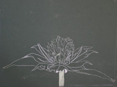
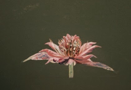
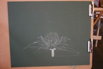
Bee Balm on Dark Green Mat Board


Working on a dark support, you cannot simply save your whites, but have to "come back" to them. Also, to have intense colors, you need to give them support. Here is where we learn why canvases are traditionally painting white Gesso!

You can try and do your fine sketching with traditional pencil, but there is the danger of embossing the support trying to make out dark lines.

White makes a much better sketch. Always use a very sharp pencil and press lightly. If you are careful not to press down, you can erase, or use erasable pencils.

In a drawing like this I will do the entire main or focal point in an underpainting of white. This will allow the greatest contrast with the dark background. White is the most reflective color and will add vibrancy to the layers of reds and greens going over it.

It will take multiple layers to get to any real vibrancy in this painting. Starting with the lightest reds and building up to the darker reds, blending each layer in, first with pencils, blending pencil then with a stump. Layer after layer until the colored pencil more closely resembles an old painting. At times I do use mineral spirits. But more with stump and wax blending pencil.

Even though the background is not the focus of the artwork, it does not mean it is not important. You need to decide just how you are going to handle it, what emphasis it will have. The background not only sets the mood of the piece, but supports the main focus of the artwork. Do not neglect this. The tendency with a dark background is to simply let it go. But choose to allow your background to support the composition.

 
When all is said and done, taking the time to layer in color and to carefully blend the layers of color is worth all the effort.


Monday, April 7, 2014

My Dad’s Holly Hocks.


Finished. My Dad's Holly Hocks.


While working on this I broke out a tube of paint that was given to me. One I would never have bought.


it is called Indian Red, and it is the color of dirt, or rust. A very earthy pigment. And strong!!!!


It gets everywhere, like Prussian blue.


While I was not thrilled with it, it does tone things very well, Adding a tiny bit ( and I mean tiny, it is very strong!) it toned down the tube green in the stem to a more natural color.


I also added it to shade the strong red pigments used to create the pinks for shading and shaping. Like it much better than any other pigment.


While I think this is successful, I am not sure I am all together happy with the rather strong background blue. It was an experiment, but I think for myself, I would prefer a more natural, skyish blue.


So often we think of backgrounds as an after thought, so I was trying to see how to ramp it up. Now, I did not want that smooth, glass finish you sometimes see, but was trying for something more bold. I don’t think bold is me, thought. Although this painting does work, the really strong background demanded a stronger hand with what to me are rather delicate flowers. But it did not work with the intense background of the cobalt blue background. Actually, I would like them better in a natural setting.


I might do this one over, with a more natural sky and more delicate shading for the blooms. I will use the Indian Red, though.


Monday, March 17, 2014

Drawing with Colored pencil-mixed media


A Tale Of Two Paintings


Started a third colored pencil painting to complement the magnolia paintings. Some format for a different flower. While the magnolias are huge, the third was a much small bloom, but still dramatic. I wanted to do a bee balm, a flower many people react to more as a weed than as a valuable plant. However, it was to be on the same dramatic scale as the magnolias.


sketch in WC Pencil drawing 1
But unlike the magnolia flowers I started with white board not dark green. I thought I would work more with the watercolor back ground than with the other two.

I started with a lot of enthusiasm, but as I went on, I began to think I had made a mistake.

Especially when I got to the watercolor background I was not very happy with it.

 I worked and worked and worked, but still felt dissatisfied.

So I started over on the green board with a white colored pencil drawing. This is much more like the first magnolia drawing and gave the more dramatic effect, I thought, that I wanted. But I still worked on both drawings, and as it went along, the first one developed independently from the first two.


Second start.
While it does not necessarily relate to the magnolia drawings, it is beginning to stand on its own. Each piece has its own merits. Neither is perfect. Art does not need to be perfect.

That is not the point. But does it convey what you are going for?

Each of these starts with the same premise, and both break the "don't center it" rule.


This is intentional. It does make for a little discomfort in viewing which I think creates the "look at me" look. These drawings focus on bee balm just after peak. When the flower is starting to fall apart, and the seeds are just starting to form at the base of the blooms' tubes. While they appear very detailed, they are not, with only suggestions of the future seeds. The heads are darkening and the leaves are beginning to loose the green color, revealing the actual pigmentation of the plant. Now the second, with the darker background was more what I envisioned, but after both were done and matted and framed. I think the 1st one, mistakes and all is the better picture.  What do you think?

Green background, finished


1st drawing with washed in background.


Monday, November 18, 2013

Roses, Roses and more Roses

Started some new paintings, of roses.


Bunch of Roses
I love white roses and have been using them to teach value in art classes, so I decided I would paint a few paintings of roses.


One is 11 x 14 gallery wrapped and the other is 16 x 20, wrapped canvas, but of standard depth.


The first I started by simply painting a streaked background, then when it was dry, just putting random roses in a sort of bunch.


I started to layout some stems with the thought of putting them in a clear vase, but I don't think I will. I will leave the stems vague, and little to no leaves, and I am not going to paint in a vase at all. The way they are bunched together, it implies a vase, but only by suggestion.


single White rose
The second, smaller canvas will be of one perfect open rose. The background will be mostly muddled greens and yellows, but with a couple of leaves and fallen petals, but lacking in detail, except for the central rose itself. That will be detailed. But nothing else. Right now there is a second rose in the background, but I think I will paint that out, it competes with the first rose and adds nothing to the composition.


Monday, October 14, 2013

Drawing a Spider Mum

Started a new drawing today of a spider mum. I have always loved these flowers and fall seems like the ideal time to try and draw one.
Spider Mum layout
This is more in the line of experimenting. It will be a mixed media, in a way.

First I sketched it out on tracing paper, then transferred the drawing to a piece of mat board. Mat board is heavy enough and textured enough to take multiple layers of colored pencil.

After the flower was transferred to the mat board, I put on a layer of watercolor pencil, in complimentary colors. I don’t know if this is the best idea for colored pencil. I generally do this for oils. I like the rich colors it results in, but we will see how effective it is with colored pencil. I have some concerns. This is a lovely orange/yellow chrysanthemum. The compliments of orange/yellow are purple/blue. I am wondering if these might be too dark and pigmented for over “painting” with lighter colors of colored pencils.
Watercolor pencil underpainting

We will just have to wait and see.
 
As tempting as it would have been to rush the underpainting
layer, ea. Watercolor pencil, I did take the time to put on several layers of watercolor pencil. Then I stood back to see how it all looked. Sometimes you can see what is happening in a layout better with the compliments, rather than a more realistic take. I also added a bit of green to suggest some foliage, but I am not going to put in any real leaves or stems. Just the suggestion that they are there.

Thursday, April 4, 2013

Crocus Drawing in Colored Pencil - Start

drawing on tracing paper


Started a new drawing.


It is part of the colored pencil magazine on-line drawing challenge.


I started by sketching the layout on tracing paper.


1. because I like drawing on tracing paper. It is easy to draw on and easy to make corrections to, so for me the ideal medium for layout


2. I am going to do this on black paper and drawing on the semi-transparent tracing paper makes it easy to transfer the design to the rather fragile black pastel paper.


Pastel paper has a better tooth than watercolor paper, at least for me with colored paper. But it is more delicate.  It is easily scratched and dented. Once you get scratches or dents in the paper, you can’t get them out.

 
back of tracing paper with colored pencil

With the tracing paper I can make my own transfer paper. I don’t have to use graphite at all.


Turning the paper over, I simply take a soft white or light pencil and softly transfer some pigment to the back of the tracing paper. Then using drafting dots place the tracing paper over the paper I am going to use. Then using a blunted pencil, I transfer some light lines to the black paper. Because I am using the clip board drawing board I can check to make sure the lines are transferring, and that I am not getting indented marks.


White lines transfered to drawing paper

Saturday, February 18, 2012

On My Easel February 18, 2012


I started a couple of paintings. This is normal for me; I seldom work on a single painting, but several. This makes sense, as I tend to work small. Up to now, the largest painting I have done is 16” x 20”. More often I work really small, like 2.5” x 3.5”. But I have this really large canvas. 16” x 48” and I have several 12” x 12” square canvases.

Over the summer Hubby and I went to Greenbottom, a nature preserve along the Ohio River. There the water lotuses were in bloom and I have wanted to do a painting or two of them. The 12 x 12 will be a close up of one of them almost open, with the light coming through.

Sketching it out, the underpainting seemed to go well. The lotus is slightly off center, etc. But the next morning, I was unhappy with it. The water lotus is leaning and I think much too small. Also, the purple/blue combinations I used did not really please me. The water is much deeper blue and the leaves more Thallo green than viridian. But that is what underpaintings are for, to see if you got it right.


I was going to do the larger canvas in an expanded vision of the square canvas. I had it underpainted. I did a detailed drawing, sketched in out on the large canvas but there it sat, I could not make myself start it.

Even after I started the square canvas the large one just sat on the easel. Finally, I decided deep down I did not want to do it. All that minute detail! What was the point, a larger version of what I usually do? What I had set up was in reality simply a very large still life. What’s the point? Deep down I did not want to do this painting, and it was stalling me from doing any painting.

This big canvas calls for large strokes, a bigger vision. So I painted over the first layout, with broad firm strokes of a hazy sky reflected in still waters. This went so quickly I new it was right!