Showing posts with label drawing. Show all posts

Tuesday, April 28, 2015

Drawing: Horse, Rider and Dog Day 1


Started a new project. It will be a little more complicated than my normal artwork. Usually I have a single subject which I work on in detail or a large overall landscape. This time while I have a subject, it is more complicated than a single object or collection of objects. It is a group portrait?


A horse, its rider and a dog. I love the composition. It has something I really love in art, humor.


The surface I am using is colourfix paper, from its cool pack, Fresh Grey. This is a pretinted, toothy paper designed for pastels, charcoals, etc. It is good for colored pencil as it is strong enough to allow the use of multiple layers. It allows for blending and burnishing without crushing the paper fibers.  I used a similar surface for my pelican drawing. This surface also takes most paints.


This time I am using the paper form, not the board form, in a smaller size. The finished work will be 8 x 10. Maybe a little small for the detail I plan.


I did the basic sketch on tracing paper and then used white graphite paper to transfer the drawing to the work surface. Then using erasable colored pencils I blocked in the basic design.


Often I will do the base layer in water soluble pencils and then “float” the colors in a wash to lay down the basic design, but decided this time to simply use the eraseables.


Friday, March 13, 2015

Drawing Company Coming!


Need to clean the house, expecting company,


Have to pick up and dust and clean the floor, mean to bake cookies, so I am welcoming.


Ok, oven is on. Dishwasher going..


Dirty clothes picked up. Oh yes, the guest bath. Need to check it! So far so good.


I have so much to do! Dust everywhere, dishes in the sink…


I got the table out and set up…..


Oh, no! colored pencils,


Must resist…..

            Must resist……………

really I must resist! I have 6 people coming! Got too much to do!
 

Opps,


Colored pencils won!


Monday, June 2, 2014

Drawing From Life, June 2014


Everything is beautiful and everything is interesting. Look around and see what is really there. Notice the texture. Notice the surface. Are the edges hard or soft? How does the light hit it? Examine it. Shadow and shading change constantly.


Drawing from life, ea. From what you see, it different from drawing from a photograph.


When you draw from a photograph, you are in essence coping the photographer’s composition, or point of view. The lighting, distance, arrangement are all ready laid out for you.


But when you are drawing from objects you have selected and arranged, it is different. Also, your perception of these objects are much different from when you look at them in a photograph. Photographs are flat.


Looking at the real objects gives you to sense of 3-dimension you will never get from a photograph.


Walk around and move objects. Let the arrangement be your selection not  what someone else selects.

Tuesday, April 1, 2014

Yes, I do Paint Once in a While!

It seems that all my recent posts have been about drawings, mostly with colored pencil, but basically, drawings.

I personally, don't see anything wrong with this. For me, drawing is a perfectly acceptable art form, and as valid for a finished work of art as any other medium. Not just means to an end.

Because so many art works beginning with a drawing, sometimes it seems like it is only a preliminary medium.

And I have noticed that some other artists tend to look down on drawing the same way. It is a way of working through a problem in composition. Of writing down mental notes.

Thumbnail sketches on napkins, pencil lines on watercolor paper, just notes, right? No. Art is art, whatever the medium. Drawings are as valid as any other art form.

So for all the pencil artists out there, keep your lead sharp and draw on.

But I do paint once in a while!

Tuesday, July 23, 2013

Art and business

A lot of us draw, paint, etc and from time to time sell a few things, or we do the fair circuit, but do we think of ourselves as running a small business?

Helen South wrote a interesting blog about this and has a number of good links to running a small business as an artist.

drawsketch.about.com

Friday, November 30, 2012

Drawing Classes


Busy week at the Renaissance Art Gallery studio. Wednesday’s drawing classes are all working on different projects. Some are doing their own version of the 3 Red Pears still life, but others are on different subjects all together.


working on perspective drawing
One student is preparing a portfolio for college entry and is working on a perspective drawing. Another is starting cartooning.


Evening classes are working with color pencil as a medium and learning the tricks of the trade, so to speak of working with these wax based pencils.
Using a solvent on Colored Pencil
beginning cartooning


Friday, November 23, 2012

Squash and Pomegranate, a Drawing in Colored Pencil


Done yesterday instead of cooking them.


Worked on pastel board with colored pencil. Not completely happy with this pastel board for colored pencil. Still have not found the perfect support yet.


Thursday, August 30, 2012

Drawing What You See, Not What You Think You See

Drawing what you see, not what you think you see
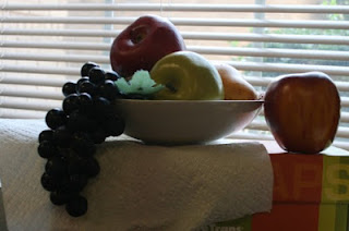

Sill life set up
Sounds funny, doesn't it. Of course you are trying to draw what you see. But doing it can be tricky. I had a student, a man, doing a simple drawing of a still life. (drawing from life can be an real eye opener!) It was of a shallow bowl containing 3 apples. He worked on it for a while, then I stopped him to really look at the drawing and see what was developing.


Still life With Fruit
Now, this bowl was on a box, at eye level. But he drew it as if he were looking down on it. His minds knew it was a round bowl, even though from the angle he was looking at it, he could not see the roundness of the bowl. But he kept trying to draw it as it was, not as he actually saw it.


what was drawn
The same thing often happens when we try to draw a chair. If the seat is near eye level, we will see a rather flat rectangle, but our mind will almost force us to draw that seat larger, big enough for our, well, backsides, to fit on it! So what happens is that we have a chair that appears to be falling apart!

Frustrating!

Learning to draw exactly what we are seeing, from the viewpoint we are looking at right now can be hard. But this is the key to learning to drawing. You must retraining your vision. Actually, your vision is fine, but you have to learn to trust it. To believe it.

After a certain age, when you have mastered holding and controlling your pencils, and other tools, what you need to do to learn to draw is to master perception. And to learn to see what is actually in front of you. And fight the inclination to draw anything other than what you actually see from the “now” point of view.

You need to fight the urge to jot down the short hand symbols you have relied on. Now there is nothing wrong with this symbolism. This symbolism is what allows us to learn to read. (One reason it is not necessary to try and teach young children to draw realistically before they are ready. Very young children are immersed in this symbolism, and it is necessary to where they are in the now).

Later in life, you do want to get beyond the symbolism. Lollipop people are not good enough. If people cannot make it beyond this, make the jump from the symbolic drawing of extreme youth to some level of realism; most will give up on art. At least, they will give up on drawing. It always surprises me how many painters and other artists really cannot draw, and do not like to draw.

You might think the ability to draw would be fundamental to any artist and art student, but sadly it is not. Many painters do not draw well, and never draw if they can help it. This is sad because they miss out on one of the greatest joys of art. And it is more than anything this inability to see well. To focus on what is really there and reproduce these “real” shapes.

The First Step

The first step in this drawing is finding the basic shapes in things. Getting down the true and real relationships between objects and even parts of objects and their placements. Yes, this involves perspective but don’t panic, we aren’t going there now!

Mostly it is about placing things where they belong and in the right sizes. It can be as simple as that. Getting things where they belong, and sized correctly in relationship to other objects you are including.

Many people will say, well what is wrong with his drawing, it is creative. It is only creative if that is what he wanted to do. But you see, he thought he was drawing what was before him. This is what he wanted to do. When I point out to him what he had actually done, he was stunned. So no, it is not "creative".
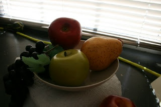
Above the still life
Look at what that still life set up would look like from above, the angle he was drawing. Here we do see the curve of the bowl. But we see very little of the side. Also we see the fruit from on top, not the side view

Now the still life set up as he was viewing it was from straight on. From eye level, the round bowl appears as a straight line, with the side of the bowl in view. And the fruit, from that angle is seen totally differently.

I want people to be able to really see what is in front of them. To be able to really see and record what they want. If you want to change the view, let it be because you have decided to, not because you cannot do anything else.
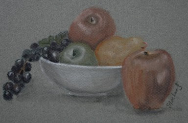
Still Life with Fruit


Sunday, June 24, 2012

Drawing

Drawing start in your head. Drawing is the result of what you see. Seeing is not simple. Yes you see with your eyes, in the light goes in, stimulates the cells at the back of the eye and send a message to the brain, but it is the brain that does the actually “seeing”. Turning these impulses into a mission and is responsible of our understanding of what we see.

Friday, November 11, 2011

Colored Pencil Drawings-The first true Layers

First True Layers

For the actual colored pencil paintings I switched from watercolor pencils to professional quality fully pigmented pencils. These are wax based, and predominately Prismacolor. I really like the quality of pigments used. Even the white pencils have coverage, which if you have used colored pencils you know is not always the case.

The Singer

For the singing bird, I set out Cloud Blue, True Slate and True Blue. I want the blue-gray sky I remember. The first layer was cloud blue, followed by a layer over the top half of the painting of true slate. After blending these two together, I decided to leave off the true blue. It just was not the color I wanted.

My mat board is mounting on my drawing board, not my drawing table. Yes this allows it to be portable, but it also allows me to rotate the board as I go. This avoids any directional ness in the background, very important when you are working with more or less solid colors in the background. Using short circular strokes and rotating the board is the best way to get this that I have found.

Commanding Cardinal

I want all the focus on this close-up of the cardinal. I am afraid if I add too much background detail it will distract from the bird, and the artwork would loose its focus. Sometimes you can put too much in a work of art.

So I am simply going to put in a yellow-green moddled background. The color will support the cardinal, but there will be nothing to distract from him. I used several different greens and two yellows. Unlike oil paints, I find it is a good idea to have as many colored pencils as possible for depth of color. These are put in random swirls and carefully blended together.

I concentrated at this point on the backgrounds not the subjects. Once I had color where I wanted it, I did use solvent and a cotton swap to “melt” the background colors together. Do this carefully, as this become totally permanent and cannot be lifted after it dries.


Drawing Reference - Commanding Cardinal

Commanding Cardinal

Background – Reference Photo

The cardinal, on the other hand is a frequent visitor to the bird feeder outside my living room window. He has been known to let us know when the feeder is empty.  The background in the photo is out of focus leaves and lawn. I do have many pictures of said leaves and lawn and could easily add these details. But I am not going to.

I want all the focus on this close-up of the cardinal. I am afraid if I add too much background detail it will distract from the bird, and the artwork would loose its focus. Sometimes you can put too much in a work of art.

So I am simply going to put in a yellow-green moddled background. The color will support the cardinal, but there will be nothing to distract from him.

Monday, October 17, 2011

Colored Pencils


I love colored pencils. Lets be honest, I love pencils, colored or otherwise.

Colored pencils have changed over the years. They have gone beyond those hard, lightly colored things we used as children. What has been happening with colored pencils thought is not short of being amazing. Pencil manufacturers have worked diligently to create pencils that are quality art tools.

Still there is a stigma to using them. Because colored pencils, like crayons are art supplies given to children, many artist and art critics dismiss them as child’s play. This is unfair, because many artists are missing some fantastic artistic experiences. This in general is how many view anything drawn. It is seen as preliminary, not serious artwork. This is prep work for serious art, not artwork in and of itself.

Both artists and art organizations are working to overcome this perception. Colored Pencil Society of America


Colored Pencils

How have they changed?

There are now many, many options for colored pencils. Each year a new brand comes out, new colors or a new format. One of the drawbacks of color pencil is that they are hard to make corrections. To get around this, a lot of CP artists do their layout drawings in graphite, then use transfer paper to get the basic outlines on the paper. Or they draw directly on the paper with graphite. Problem with this is that graphite and wax-based colored pencils don’t really like each other. You have to lighten the graphite lines a lot, and then hope you are not left with remnants that contaminate the colored pencil later.

Last year, with the recommendation of other artists in CPSA, I tried erasable colored pencils. Yes, erasable. Prismacolor has this great product, Col-Erase. I got a set of 24 to try out.


These are erasable colored pencils. Really. So erasable they come with erasers on the tips, like our familiar #2 pencils. Now you can do the initial drawing with colored pencil, eliminating any need to use graphite.

So how do they work?

Well, I am doing a couple of miniature drawings for the 11th Annual National Miniature Exhibition. I will use my Col-Erase for the layout and first underpainting of two of them. Come along and see what you think.

Thursday, October 6, 2011

Preliminary Sketches And True Shapes


Preliminary sketches are just that, preliminary. You can concentrate on the overview, locating the major lights and darks, or you can isolate the objects/subjects you are interest in drawing. Preliminary sketches let you explore the details and analysis what you are really seeing. They can and should do a lot of things. Any really good work of art should have several preliminary sketches.

It is ok when you are out to do sketches of single objects. It is ok to do general landscapes. Sketches should be the way you explore the world around you, so be free with them. By sketching often, you can quickly come to understand how things really work.

Concentrate On That Object

When you have a subject that really interests you, concentrate on that. Draw it from many angles. Simplify it. Take it apart. Look for the basic shapes that make up that object.

Using A Photo Reference

This is true, even when using a photo reference. Or especially when using a photo reference. Photos can be misleading. Take the time to really explore what you are looking at. Don’t just jump into drawing it. Think. Art happens in the head, not on the paper. The paper just shows the results.

When using a photo reference, make a black and white copy of it. In fact, make several. Use a copy machine or print it from your computer on common paper, not good photo paper. These are working copies, not art. When you make your copies, lighten and darken the copy. Lighten the copy and even enlarging it will reveal details in the shadows that might be hard to see.

I tend to use my own digital photography for reference, so I have the files to play around with. Also I don't have to worry about copyright.

[note: never, ever work on the original file. Always do a “save as” and rename the file. Me, I put work at the beginning so I know this is the file to play with.]

With my software, I have several options to convert  a photo to grayscale. (this is what you are actually doing, converting to true black and white is not what you want to do!)Usually I use the desaturate option, as this allows me to play with contrast. You will need to learn what is best with the software you have.

True Shapes

With these b&w copies, you are ready to work out construction problems. Here I am not talking about layout and composition, but how you are going to draw individual objects. One reason I like to make the copies of my references is that I can draw right on them. This is helpful in finding the true shape of something.

“I can see the shape” you say, but do you really? How many times have you drawn a vase, then look back at your still life and find you have not drawn that vase? Not so easy, is it?

Ok now stop and think about drawing a bird or a squirrel. Looks can be deceiving! Try it, get a photo of a common bird or squirrel, then try and find the edges. Most photos tend to lose the details in shadows.

So we have the black and whites. Here the lighter versions will be helpful. Draw the true shape of things. I like to use tracing paper for this. Lightly draw around the actual edges. Now look. Surprised? They are fatter/leaner than you thought. Using tracing paper isolates the shape from the rest of the context in the photo. It isolates it from distracting patterns and shadows. You will find this especially true with wildlife. Nature plans it this way. Remember their patterns are supposed to make it difficult to see their true outlines. It is a survival thing. Once you have the true shapes, it is easier to transfer this to your drawing.

Monday, June 27, 2011

Contour VS Gesture Drawing


Just what is it?

There is a lot of confusion on what is meant by gesture drawing. The word gesture implies movement, a waving of the hands. How does this apply to drawing? There is also as much lack of understanding when contour drawing is discussed. These are two different approaches to drawing. Both are valid, but give totally different results.


Both deal with drawing what is actually see, not what you think you see. Both exercises teach you something about the real world and how you, as an artist interpret that world.


Contour Drawing


Contour drawing is simply put drawing the outline of the object or subject. Sound simple enough. But it requires a great deal of concentration. You are looking for edges, edges that might not actually exist in the real world. You are looking for the visual edges. But you are going to apply a sense of touch to your drawing.


When I was taking my first drawing class, we all struggled with this. The teacher had set up a complicated still life, and tried to get us to do a continuous lines contour of what was there. Frankly, the exercise was a failure because none of us understood just what the teacher was trying to have us do. Now, years later, I look back at that class and realize just how hard explaining this can be. You are trying to say in words what is happening in the head. Contour drawing is much more than simply looking at something. You need to see it, feel it almost taste it.

Concentration

Contour drawing is all about concentrating on an object. Also, it is about drawing from life, not a photograph. You need a real life object or subject. Something solid. You want to experience this object totally. Immerse yourself in it.

The Set Up


Draw the outline
one contineous line
First, relax. Set up a simple still life, or find an interesting object. Have a 2B or 3B pencil, very sharp! Use a fairly large piece of paper, either a larger pad or a large piece of paper attached to your drawing board.


Completed contour drawing
What you are going to do is draw this object without looking at the paper in one contineous line. Yes, keep your eyes on the object, not on your paper. Look at the object and decide on where the line will start. Pick a point that you decide is the beginning. Stare at that point until you convince yourself you are touching that point, thus your pencil becomes an extension of you. Wait until you believe that your pencil is touching the contour of this object. Yes, you can do this! You want your eye and your pencil to move at the same speed, and in union with each other. So your eye, and pencil are in concert. Without taking your eyes off the object, trace around the contours of it. When you complete one section, briefly look down and move your pencil to a new starting point, wait until you can feel the object in your mind, your pencil is on that object, then continue. This is the contour of the object. And the contours change if you shift position, so keep your head still.


Gesture Drawing

Gesture Drawing of Bow


The exact opposite is gesture drawing. It is not about edges, but volume, movement; the fullness of the whole. This is a favorite method of mine when I can see people or animals move. It is about catching the action! Seizing the moment. Gesture drawings should be rapid, fluid and very expressive. Sometimes it just might be hard to see the object/subject in the activity! Let your pencil roam the paper, fill it with the action you see happening. Draw rapidly and continuously, in one fluid line what you see happening before your eyes.


Summary


Contour drawing puts you in touch with the edges of a form, in gesture drawing you feel the movement of the whole. Remember that contour drawing is about edges, and gesture drawing is about movement.


Gesture Drawings of Squirrels
at the Bird Feeder


Monday, May 30, 2011

When An Artist Packs


Traveling with an artist is not like traveling with a normal person.


Priority is given not to clothing, jewelry or sporting equipment, but to art supplies. Sketching pad, pencils, erasers, camera, lenses, —these have become standards, but we must add to the list. With new technologies, new things are added to the pack.


This brings up the question, what do you Pack when you travel?


Real essentials, sketchpad, drawing pencils, watercolors, are still basic but now many of us add Now memory cards, laptops, CD’s and DVD’s.


“I Told You To Pack Light”


On my recent trip to visit family, the watch word was “Pack Light”. We were traveling by car, and with family, including a dog, space was tight. Add to this were gifts for distant family members. I have a small overnight case for those non-essentials like underwear and cosmetic, and a duffle bag for what I truly can’t live without.


My packing List


· 1 sketchpad, 9x12 medium weight

· Pencil case containing drawing pencils, HB, 2B, 4B & 8B

· 3 erasers, white vinyl, pink pearl and kneaded

· Fine tip drawing pens

· Blending tools

· Eraser shield

· Pencil sharpener

· Small set of CP

· Small palm sized sketchpad

· Journal

· DSLR camera, lens, memory cards, in case

· Laptop with CD and DVDs. In case with cords


That’s all. A rather modest list if I do say so myself. Still, I get those looks from family when we are loading up.


So I think more about pencils than toothpaste. Heck, I can buy toothpaste everywhere, but you can’t always locate a really good pencil!


PS. Leave a comment with your packing list!


Monday, May 2, 2011

Sketchbook Project 2012


It’s Arrived!


My sketchbook for the “2012 Sketchbook World Tour Project”.

For me, its just in time. Monday I am taking off with my Mom and older sister to Northern Illinois for a visit with my other three siblings. We have not gotten together for years. Last time we were all together was when my Father became seriously ill, just before his death. That meeting was so overpowering sad, that it almost does not count. This get together is long overdue! We need to get together in a happy sense.


Long Trips and Short Phone Calls


Each person who signed up for the project got to choose a theme for his or her sketchbook. I chose “Long Trips and Short Phone Calls. Seemed like a theme I could relate to, since I am the worst person for phone calls!


It’s a 2 day trip to my younger sister’s house. I guess that does qualify for a long trip. And I seldom make phone calls of more than 15 minutes. I am like my dad in this, as I really don’t like to talk on the phone. I can never think of anything to say until after I hang up.


The Price Of Gas


The price of gas will certainly affect this trip and any future trips I might contemplate. Today it hit $4.29, soon to be $4.50. At these prices the car that once took $20 to fill up now takes $50 or more. How far can you afford to travel when your money is eaten up like this? Like artists are so over paid as it is!


I find I have second or even third thoughts about running up to the store, much less taking an actual trip. I think if my younger brother didn’t already have his tickets, we all might re-consider this!


But I am glad we are not. Yes, it is going to cost more than we thought when we set this up months ago, but we need to see each other. Phone calls and web cam visits just don’t satisfy my growing need to actually see people I am related to. But I need to get what I can from this trip, as it is likely the only one I can afford to make this year.


Plans on Hold


I had planned on attending an oil painting workshop next month at Cheap Joes. I went to one last year, and found it really both fun and educational. Yes, I learned a lot from the teacher, but I got as much from other attendees. Simply being with 20 other people who shared my passion for oil paintings was stimulating artistically. But I don’t know if I can swing it this year.


Another trip in jeopardy is our autumn sojourn to New England. I have been over much of this country, but never to New England. We (hubby and I) had planned on taking two weeks this fall and driving to straight to Maine, then taking our time to drive back. But now, two weeks of driving? That is going to cost a small fortune. A fortune I just don’t have.


My Sketchbook
Trips and Phone Calls


So it looks like my trips will transform into phone calls, and how do you draw a phone call?


*~*

For those interested in joining me in this project, here is the link to Art House and the project page:Art House & the Sketchbook Project

Tuesday, April 19, 2011

People Are Sight Hounds


We rely on our sight for hunting. That is the way we developed and this ability to see and compare quickly, is one key to our species success. What we see has power for us and over us.


It is our bases for reality. This is not the case for all species. Dogs, for instance get 80% of their environmental information from their sense of smell. For them, smell is more real than even sight. While they do know what we look like, it is our smell that does the final identification of us. We rely on what we see.


Visual cues and clues are extremely important to us from infancy onward.


First emphasis is on facial recognition, eye to eye contact. Eyes draw our eyes from the first and what we cannot see disappears.


Peek-a-boo


This link between sight and reality is what makes peek-a-boo such an exciting game. When something is out of sight it does indeed disappear for the baby. And why what we see has so much power over us. There is some truth to the saying “out of sight out of mind”.


Things we see are real to us, even when they are not. How often have we exclaimed about how realistic something looks, how a painting almost looks as if we could walk into it. Been fooled by some Faux finish into thinking an object was one thing rather than another? No dog was ever fooled by a painting. Now, an odor?


But to us, seeing is believing.


We use drawings to communicate information and to clarify things all the time.


“I see” said the blind man, as he picked up his hammer and saw.


This dependence on sight is reflected in our language. Seeing is equated with truth, knowledge and understanding. “I see” we say when we understand. The word see and understand are synonyms. Most often when we use the word see, we are referring to knowledge rather than sight.


The light bulb goes off, the idea is illuminated, bringing it into the “light” and making it understandable.


This dependence on sight is what makes visual art so powerful and at times so controversial. We see it, we need to understand it. We are uncomfortable with art we don’t understand. It is subliminally threatening to us. So photo-realistic art can be comforting, reassuring to many viewers.

Saturday, February 5, 2011

Drawing the Winter Landscape Part 4- Value and Light


Reference Photo
Value and Light

There are several challenges in doing a winter landscape. You have to making the show look real, dealing with the subtle and necessary value shifts and working for the soft texture you need to make the snow look nice and fluffy. So often it is not a mater of drawing the shapes, but shading in everything around it. Dealing with the negative shapes, which in this case are white or near white. One of the biggest challenges is finding your darks, and not being afraid of them. Shadows and shading are all important.


Light source


It was a snowy day in early March, one of those deep spring snowfalls that bring such a soft blanket of snow to the area. We had had a real storm, with thunder and lightning thrown in with the heavy snow cover. But the day these photos where taken had been a rather bright, sunny day so there are nice shadows and contrasts.


When this photo was taken, the sun was beginning to lower in the west, but the shadows were not yet very long. Keeping this in mind, I know the sun would be to the right on this drawing, so things sloping away from there would be in shadow.

Shadows and Shading are all important in any drawing, but they become obvious in a snow scene. There is value to white. Angle of sight changes things. sometimes in large ways, but more often in small ways. How well our drawings turn our depends in large measure on how well we deal with both types of shadows.


Cast Shadows and Contour


There are two types of shadow or shading going on here, the cast shadows from the sun and the contour shading you get with any 3-dimentional object, like the columns of the trees. Both are necessary to work this drawing. Since in this photo reference the trees now become the focal point, handling both shadows is very important.


Working the shadows


There are two ways to deal with these shadows. You can use softer pencils and rework these shapes, and you can use blending tools, like a stump or tortillion. Many blending tools are possible for any drawing. I tend to favor the judicious use of kneaded erasers. This seems to work especially well on snow scenes. Sometimes it is just as important to remove graphite, as it is to apply it


Winter Drawing
3 Trees
You as the artist must be sure of your light source. This is especially important if the photo reference you are using is unclear or confusing on this subject. You must be sure. If the artist is confused, the work will be confused. Now, on this project I have a slight advantage, as these are my photographs, and I remember the conditions when I took these pictures. But you might have to simply pick or study the photo for clues as to the time of day and where and how strong the light source is. I have been known to draw myself a little sun on the paper, outside the margin to remind me where the light is coming from!


Friday, January 21, 2011

Drawing the Winter Landscape Part 3 - A Departure

--First I must apology for the lateness of this post. The work was done, but illness prevented me from posting sooner. I will leave this post up a bit longer and give you a chance to view and comment--


Being inspired by a reference photo does not mean you are locked into what is in the photo or even its presentation. The reference photograph is for inspiration only. Nothing in it is sacred. In all you are going to do is repeat another artist’s work, why bother?


For this rendition of the 3 trees reference photo, I am putting away the pencils. What really intrigues me about this winter photo is the strong contrast between the white snow, dark water and virtually black trees.


I am going to depart from the standard grayscale graphite drawings. For this drawing I am trying to achieve a different feel. I am going to depart from the reference but one thing I do wish to retain is the narrow presentation, the aspect ratio. Aspect ratio is simply the relationship of length vs. width. How the height compares to the width. So in laying out the drawing space, I will make sure the length vs. the width ratio stays the same, although I am going to increase the overall size. In this way the narrow presentation of the work will remain while the drawing will be a bit more substantial.


Increasing the size, but keeping the proportion is possible. You could simply double the measurement, but that might not give you the size you want. But there is a rather easy way of doing this.


Drawing paper with guidelines
First, I decide where on my paper I want the bottom of my drawing to me. I like to leave myself a bit of a margin all around the area I am going to do the actual drawing. This gives me a margin to tape the paper to my drawing board, fasten it down and keep it stable. For this I use drafting tape, not masking tape. With my t-square (but you can use any straight edge) I will draw myself (lightly) a horizontal level. Also with the t-square (and this is important) I will find the left edge of my drawing, and draw a line perpendicular to the level base line. This line really needs to be at a right angle to the first level base line. This gives me the lower, left hand corner.


I then take my reference photo, and fold back the white margins. With a drafting dot or a small piece of drafting tape, I put the lower left-hand corner of the reference photo on the lower-left hand corner of the drawing area. Then with a straight edge I will take a light pencil and draw a diagonal line from the lower-left hand corner to the upper right hand corner of the reference photo. Also with a light line (one that is highly erasable) I will extend that line onto my drawing area.


Reference photo on drawing paper


Vertical Line

Having decided the width I want for this drawing. I will draw a border vertical line with my t-square up until it meets the diagonal line. Where the two lines cross I will (with the t-square) draw the top-level line for my drawing area. Wa-la, we have an enlarged drawing area, which is in the same proportions as the reference all without a calculator!

Add top guideline


Now, on to the drawing. You might have noticed in the photographs that the paper seems rather dark. No, the picture is not reversed or turn out too dark, it really is black. And the guidelines are white.


Black paper might seem like a strange choice for a drawing that is essentially white, but it can be very dramatic. Don’t’ be afraid of color paper! Use the paper as a part of the creation of the drawing.


The logical choice for a winter scene would be white, and white paper is the standard for drawing (or anything else for that matter) the choice of black paper necessitates a change of media. There are many media that would work well on dark paper, colored pencils, metallic ink, conte’ pastels, markers, charcoal. While you might not think black charcoal would work on black paper, it does, beautifully.

Choices


Compressed Charcoal Sticks
I want to maintain the sharp contrast of the reference, even emphasis it. So I have chosen to work with sticks of compressed black and white charcoal, relying on blending tools and overdrawing to give me a range of grays.


Working with a stick of compressed black, I lay out the major divisions, re-enforcing with the compressed white charcoal. Starting with the background and building by layers, the drawing is slowly built.


Layout the drawing


Blending the sky

Building up the snow

White charcoal is applied to the sky using the blunt side of the block. Then a cotton swap is used to blend and even out the sky. It also removes most of the white, allowing the black of the paper to change it to a soft gray. Major snow backs are built up this way—apply—blend & wipe. Water is built with careful horizontal strokes—white underscored with black then using a tortillion to blend and push the charcoal around. Various vertical strokes fill in eh background alternating between white and black. Blended together we get soft gray shapes that resemble trees in a snowstorm.


The foreground calls for bolder, stronger strokes for the 3 major trees. White over-lays the snow. Here the contrast makes the drawing.


Finished Drawing on Black Paper

So, this is the completed drawing. Any comments?