Wednesday, March 14, 2018

Orange Roses, a Beginning

This winter has been long, cold and snowy.

Not at all pleasant.

However, the sun room has been just that. Sunny. I love working there in natural light. So with the help of many bunches of roses I am working on several still life drawings/paintings in Colored Pencil.

These orange roses present a real challenge. Orange is not an easy color to work with, and getting all the small shade differences in them to make the roses seem real is not easy. Something that is also presenting a challenge is the leaves. So many minuet value changes. How to work with them and have them come out as leaves, not just blobs of green.

Like all drawings the initial stages makes one wonder why you started this and if anything will come of it.

I first used erasable pencils to draw it in. Orange for the roses and stems and white for the vase. Using a light touch so as not to inscribe the surface of the paper.

I am working on Colourfix paper, in a neutral gray/blue. This surface has a sanded tooth, much like pastel paper. It can be hard on pencils, but it does hold many, many layers of colored pencil. It is also very durable and allows both blending and burnishing. It will also take many applications of solvents, whether you use mineral spirits or a blending pen. Not all papers do. Some are much more delicate and cannot take multiple layers.

One of the first things I did was try and locate the highlights of the flowers and leaves and underpaint them with white. This way, when I add the orange these areas will naturally be lighter than the rest of the leaves and petals. I also used crimson red on my darker areas of petals and purple on the darker areas of leaves and stems.

I do know that the vase and the distortion of the stems in water are going to give me fits, but if there is no challenge, is there any point in continuing?

Monday, February 26, 2018

Flowers for Still Life


One of the nice things about holiday flowers is that they all go on sale the day after. So the day after any holiday, but especially St. Valentine’s day, all the really pretty flowers are available for take home.


Makes getting subjects for artwork much easier and affordable. The bigger the holiday the wider the selection available.

Yes, many of them are damaged, and some faded. Don’t overlook the imperfections, however whe
n selecting interesting subjects. 

Monday, February 12, 2018

White Rose


Today is bright and sunny after weeks of dull, gray snowy skies.

I am working on color correcting my white rose drawing. How do you color correct white?  In nature or the real world, colors are seldom absolute. Even something that is actually made a single color seldom appears that way. It will have various tints and shade due to the lighting, the complexity of the object and natural contours. As artists we need to be sensitive to this. It is how we get our 2-dimensional drawings to represent a 3-dimensional world.

So today I color corrected my white rose.

Actually the white rose is not completely white. They seldom are. They are usually tinted a bit cream, blue or in this case, blush.

Looking at the heart of the rose I see the blush shading to a deeper pink to peach and coral. I even see a little green and violet in this rose. All of this must be brought out in the finished work.

But the light is fading--so I need to stop until I can see all the find shading/tints and details.

Monday, February 5, 2018

Working Petal by Petal

Erasing the grid lines from each petal as I work it--locating and isolating each in turn. I am trying to work building the gradual blending from light to dark, noting both the shadows and highlights. As with all real objects, I have both cast shadows and contour shadows. This is what gives work depth. As I work I must keep in mind the shape. These petals are not flat. The go up, around and out. They have dimension. And the challenge is to show this in each petal. Color and value gradates up and out of the petals. While there is a natural change from the blush to white, there are also qualities to these hues. As the petal goes away from me, even the white will become darker, tinted as the light shifts.


There are also the bright highlights where the light source hits the rose dead on. These must be the brightest, purest whites of the piece. But even where the “color” is darkest. There will be light and dark qualities to the shapes. Parts in deep shadow will be almost gray to almost deep blush.


So I work with layers of blush, pale pink, salmon white and a full array of grays, warm and cool, with hints of very pale blue to blue-gray. Even a hint of green and violet.

Monday, January 29, 2018

White on White on White

Working on the white rose.

Just as with paints brands, colored pencil names and colors will vary from brand to brand. Light blue from one company may well be a totally different color than light blue from another company.Just how light is light blue? How deep is deep red?  Color ranges will be similar but each brand will have its own distinct hues and colors it chooses to put into a pencil.

Unsurprising this also can apply to white. In truth, white is not an absolute color, but will have qualities all its own. It can be bright, warm, cool, flat, shinny. Titanium white is not the same white as flake white or zinc white.

So working with white pencils will be the same. Each brand will have its own white.  And each brand and line of pencils will have its own qualities. There will be other differences too. Coverage, how transparent or opaque that pencil is. How hard or soft the "lead". And some brands will lean toward the warm (yellow) or cool (blue) tone. Even many of the grays will appear when viewed alone to be just about white. Only when compared and used next to the most opaque white will you see the qualities of the grays.

Many manufacturers have a range of gray. They can run from 10% warm to 90% cool. Other brands will have names but the numbers will indicate that they are different colors.

This is very good when dealing with white objects. Working with several white and a full range of grays will help to contour and object. Even if the viewer cannot detect where one pencil starts and another leaves off, she will see the object, in this case the rose as having dimension.

Using different white also helps to alter and manipulate other colors. It is hard to shade from light to dark, but using layers of whites and grays helps you to move the pigments towards the effects you want.

The order you apply the pencil can make a difference. You get different colors if you layer pink then white than when you put white and top with pink.

How much also makes a difference. Two light layers will blend differently than a heavy layer. So a heavy layer of white with a light layer of pink will look different from a light white layer and a light pink layer.

You can also burnish layers with a harder white, like a Venus or Veri-thin pencil instead of the much softer standard prismacolor pencil.

You might find that although the prismacolor is nice and soft you might find it more useful to use the harder faber-castel white for adding highlights. And the Veri-thin make a much sharper line.

Each brand will react differently with mediums and solvents also.

Getting it right takes work and practice and experimentation. So we all need to take time to play with our colors. Get to know them and how well they play with others.

Monday, January 22, 2018

Starting New Colored Pencil Drawings

I am starting several new colored pencil drawings.

Working on very toothy papers, I do not tend to draw free hand directly on my support. I will select materials, either an idea or a photograph (I only work from my own photos, so this is my work completely). Once I know what subject I want, I will play with it on sketching paper, doing thumbnails with simple designs. ea. I will block in basic shapes, shading etc.

Note on working with thumbnails. work within the general shape and size aspect of the work you are thinking of doing. Otherwise, the piece might not be as pleasing as you anticipate.

Once a general idea is done, I will do the more realistic sketch on tracing paper. it is easier to draw and erase on. This is especially true if you decide to draw a complicated image, such as the close up of a flower.

I will grid this work. Sometimes, as in the white rose I have started, I will print out on standard copy paper the photograph I want to use as the subject. This is reference. I will actually grid this, and use it to draw the design onto the tracing paper.

I usually work on tinted, high grit paper, such as sanded pastel paper, mat board or colourfix papers. These do not erase well. So I will transfer the design from the tracing paper to the board with light artists transfer paper. I find that these lines erase much easier and more completely than putting grids on my good paper with either white pencil or graphite. Sometimes I have trouble removing graphite from sanded and colourfix. Graphite also has a tendency to put dents into the mat board, and that you just cannot get rid of.

Another advantage of drawing on the tracing paper, and then transferring it to the good support is that you always have your starting drawing for reference if you get lost. And with a very complicated, detailed drawing this happens more than you might think. I

I do number my grid, ea. lower left corner is 0,0 and I mark each row and column along the way.

If I have a color copy, I also mark this with the exact same grid!

So now I have several drawing layed out and ready to go.

Monday, June 5, 2017

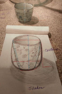
Critique: Small Round Pot


My niece sent me a snapshot of her sketch of a small round pot with the text “drawing round things is hard!”


I can see that she had trouble with this.


Why?


Well, its not uncommon to have trouble with any round symmetrical object, or any asymmetrical object for that matter.


It can be hard to keep focused on what you actually see. The brain has a tendency to “fill in the blank” even when there is no blank.


The problem here is with the “math”


Her “measurements”   don’t add up.


I can tell from the sketch that there were a lot of false starts and more than a bit of erasing.


This is one reason some drawing teachers have students practice drawing with a pen rather than a pencil. No erasure allowed. When we erase and redraw over and over we tend to get frustrated, and things get bigger. More “incorrect”.


I also see that she got distracted by the shadows and the patterns on the vase. Distracted too soon by details she lost the overall shape of the object.


If you look at the pot, you will notice that it is almost twice as wide at the top than at the bottom. Also, at this angle, the opening of the top of the pot is almost 1/3 the overall height of the pot.


What would have helped?


A couple of things.


One, a plumb or center line. Do not be afraid of putting guidelines in your drawings and sketches. These should be light lines easily erased. You can use a straight edge, but really any reasonably straight line will do. Putting in a horizontal base line to indicate the bottom width and a wider horizontal line for the top of the pot would also help. This would automatically give you guidance for the correct slop. You can see that she has her sides almost straight. The pattern got in the way.


Don’t worry about any pattern when sketching out the shape. This is not important at this point.


The strong shadow also became too important. Because of the focus on the cast shadow she did not discern the contour shadows.


I can see the growing frustration in this sketch.
 
Rather than going on and on. I think some sketch lines over her drawing will say it all. I have added a couple if guidelines to this sketch showing how easy the use of centerlines can help.


Relax.


Try again.