Showing posts with label portraits. Show all posts

Monday, September 28, 2015

Making a Portrait Look Like Her

Finally getting my Horse, Rider and Dog colored pencil painting actually look like the subjects. The horse was easy, the dog  a little  more, but the tick coloring is a challenge. But getting the rider to look like her was a little more trouble.

I had not realized just how much she looked like her mother until I tried to draw her. Also, you can plainly see her native American heritage in her bone structure. But finally it is looking like her. Finally both her youth and her heritage are showing in this piece.

I was interrupted in working on this by the necessity of going out of town on family business. Being interrupted made it hard to get back into the right mind-set for working on it.

Its funny, but sometimes you can draw for hours and sometimes nothing works. Its a strange gift.

Just a little more shading and it will be done.


Friday, May 29, 2015

Horse, Dog and Rider Again

More work done on my Horse, Dog and Rider.

blended the eyes, and made them look much better. Funny how you have to almost destroy an image sometimes to get the shading right! I know the eyes looked scary in the last post, but I needed to get the darks in for the eyes to look right. Scary, though.

These next steps are slower, requiring more attention to detail and subtle shading. Many pencils and a lot of work back and forth.

There has been more wax bloom than I expected with this pastel paper, but that is easily taken care of with a light buffing.

I did a lot more work on the horse's proper coloring, using my range of French grays, rather than the expected browns. I find these French grays closer to the actually shading you see in real hair and fur than the almost too bright browns.

The jeans have been rather fun to work with, starting with a more "new" jean blue, and using white and some cool grays to "wash" them.

The leather saddle is proving challenging. The well-worn shading of leather more problematic than I had thought.

Monday, May 4, 2015

Horse, Rider & Dog 2


blocked in.
 
The basic shapes are blocked in and the baseline colors are established. Drawing on this colourfix paper is like drawing on sandpaper. It eats the colored pencils. You can work effectively with lesser pencils at the base level. I even got out some old crayola colored pencils. I do not recommend these to students because they are so hard as to be frustrating, but the rough surface of this paper did take them with greater saturation than normal. So this was a good use of the harder, cheaper pencils. While this does has plenty of tooth, one of my major complaints for most papers, I am wondering if this paper has a little too much tooth!


The grayish background tones down the colors nicely and I think it will give an overall nice feeling to this drawing.


starting the second layer
 
Now that I established the basic level on this drawing I can start working on building up the layers and working in more and more details. It has been a challenge, as I am not as familiar with western tack as I am with English. There are many more do-dads! I will start adding more and more levels of value to all of the shapes, defining them more and more.


Tuesday, September 2, 2014

Unhappy Background

really don't like this background.
Working on three different portraits can be very distracting. But I must take time to really look at each one at each stage.

Not at all happy with the background for my son's portrait. Much to busy and distracting. Not at all what I was going for. So I must change it!

I did select a new pallet for this, related but not quite so yellow. Using more subdued yellow, red and green, created a softer green/gray. I refrained from using black or Payne's gray because of the black gesso that started this portrait.

background pallet.

I did add liquin to help the background dry. I also worked a little background into the portrait, so it would be background, not competing foreground. This way he will be in front of it.

After working the new background in and leaving substantially less of the black showing, I am much happier with this present look developing in this painting.

this background works to complement where I am going with the rest of the portrait. Not too garish, not too bland. Just the right amount of color. While it will reflect what is going into the actual portrait, it is softer, more muted.

The portrait of my mother-in-law is giving me more trouble. While there is nothing actually wrong with the background so far, it just does not seem to be as effective as the background I have on my father-law's painting. That one I am quite pleased with. That total package is turning out as the best of the three so far. I think I will need work live with the mother-in-law painting a while before I can diagnose just what is bothering me about it.

It is difficult to work on all three at the same time, but necessary. Each is providing a demo painting for different students at different places in their own work.


Tuesday, August 19, 2014

First Portrait


Wednesday Drawing Classes are starting oil painting portraits. Yes, painting in oils. First up is to select a large, 8x10 photo to use as a reference. Then make several black & White copies. Cheap, copier copies that can be drawn on.


So, how do you go about this? There are about as many different approaches to portraiture as there are artists. No one is “correct”. The right approach is the one that gives you the results you want. Since these portraits are for my drawing class, a beginner class with the emphasis on realism, we are taking a classic, academic approach and will use the skills learned already in drawing realistically. 


Having gone over the basic materials needed, we will beginning by blocking in the basic shapes. There are a lot of ways to transfer the image to the canvas, but for this we are going to do a rough block in with oil paints thinned to ink like consistency and doing a basic block in.


Using the black & white copy, we will use straight lines to define the general, gross shape of the image. Also, we will play around with placement. This can be done with simple cut outs. Once we know where we want the image, we can start by fining a starting point on the reference copy, and a corresponding reference point on the canvas. All other measurements will work from this point.


For this first project, we will attempt to draw/block in the head the same size as the photo reference. This will make later comparisons to the reference easier.


The first block in is a rough block in, for placement and overall size. We will locate the major features, the angle of the head, location and angle of the eyes, nose, mouth, and if visible the ears. 
 
Because of the demands of teaching this class, I will be working on more than one painting at time. Hope I can keep them up!
 

Monday, December 23, 2013

Portrait in Colored Pencil


"Does It Look Like Me?"


One of the artists that attend my Wednesday Studio has completed a portrait as a gift for her grand son.
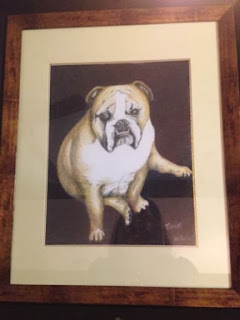

Portrait of Tank, Framed
 

Colored Pencil portrait of “Tank”, her grand-puppy.


When she came in she was overall pleased with the likeness. This is definitely Tank, not a generic bull dog. But there were still some problems. Overall there was more of the texture of the heavy paper showing than she would have liked.


“When I bought the pad, (it is #140 lb paper) it said ‘Gray Scale’ on it. I thought they were talking about the color, now I think it is the texture of the paper, scaly!” was Mary Anne’s take on it.


The pad does scale through all the shades of gray. And I am sure this is what they meant by gray scale pad, but the texture of the paper is very definite and it can overpower the art done on it. And it looks like scales. With colored pencil this can be a problem. Finding a support that has enough tooth to hold the colored pencil but does not have an overwhelming texture.


Also, she was not at all happy with the forepaw. It looked like a blob, she said. The fine details were giving her trouble. There were also details in the face that needed attention.


It took some time to stop    and    think.


When you run into problems in art, the instinct is to push ahead. Drowned it in details, in fancy brush work, lines or gobs of color. Wrong approach.


Stop


          and


                    Think.


Art happens in the head first, and here is where the solution will reside.


With Tanks paw, we had to come back and think of just what we were drawing. The leg is a column, the foot (paw) is basically a rectangle attached to the column (leg) by a fat little ankle. So these shapes must be accurate first, then shaded to give shape to the volume. The shapes of the shading is important too. It needs to make sense with the light source, and there is always a light source, or how could we see it!


Once these issues were address, Tanks leg and paw emerged from the page.


Background is still there.


Mary Anne elected to have a simple, color block background. Fine, it suits the portrait well, but it still needed to be addressed with the same care as the rest of the portrait. Background is not an afterthought, but an important part of the composition.


Sometimes we as artists can be a bit lazy about this, or even cheap. We don’t want to spend our time and effort on what may seem an unimportant part of the art. But a good background is what makes the subject pop.
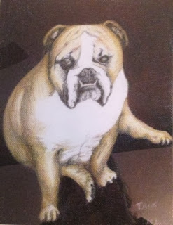
 

This is Tank,
And he is looking fine!
So time was spend to develop this background, first layers of crimson lake then blue indigo. Not just one layer each but multiple layers red/blue then red/blue. There is even a layer of black in there.


The result? A strong background that makes tank jump out and give the appearance of an oil portrait.


Other than the canines, bull dogs have rather small, delicate teeth. These where hard to get with regular pencils. Here is where Very Thins, by Prisma color came in. These harder pencils are not something you would want to use every day, but are just the thing for fine detail. Which is what they are designed for.
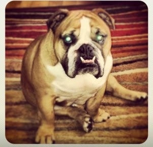


Tank- reference photo
Addressing the eyes, Mary Ann’s reference photo did not give the eyes a good go. Dog pictures seldom do, but this is a dog she knows and loves, and here memory came to her rescue. Instead of solid black, which in a photo a dog’s eyes can appear, she worked layers of black/brown and white to give his eyes life.


All in all this is a drawing of Tank, not just any bull dog.